Massassi Forums Logo

This is the static archive of the Massassi Forums. The forums are closed indefinitely. Thanks for all the memories!

You can also download Super Old Archived Message Boards from when Massassi first started.

"View" counts are as of the day the forums were archived, and will no longer increase.

ForumsDiscussion Forum → I need graphical help! (Logo)
12
I need graphical help! (Logo)
2005-06-10, 8:56 AM #1
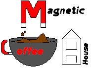
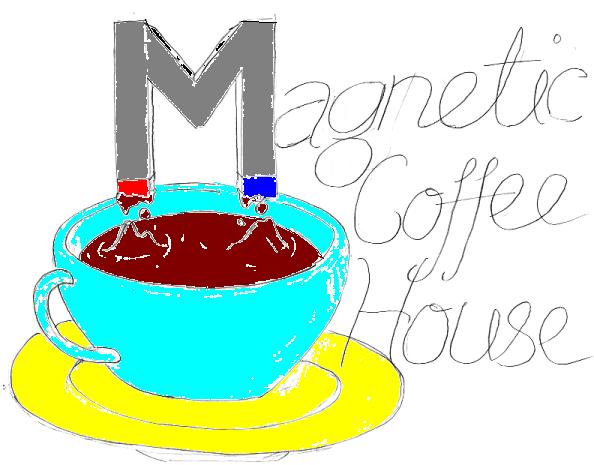
OK, so I've designed a logo for a project I've been organizing called "The Magnetic Coffee House" a poetry slam central for younger people in my city. I've got a building, permits, the whole shabang set for it. I'm thinking of putting up a website, and I also am putting together flyers. For that, I need to complete the logo. Problem is, I'm a horrible graphic designer. All of my art is sketching etc. I have several sketches of the logo, but the best representation of how I want it to look is attached.

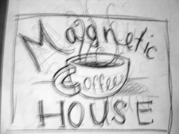
Basically, I want a deco-coffee cup with washed out colors. A plate under the cup. The handle of the cup is a magnet, and the letter 'M' is a magnet above the coffee with the coffee being pulled by it so there are space-station esque floating coffee dropplets. The Coffee part wouldn't HAVE to be part of the handle of the cup, but it's just an idea. The house idea is also not final, but just an idea I had.

If anyone could throw together something (If Yoshmi sees this, I'd be at your service! You're the goddess of deco and are the ideal person for this job) you'd be credited on the site and such. I'd REALLY appreciate this, and if it can be done today or tomorrow, it'd be even more helpful. Thanks guys!

JediKirby
ᵗʰᵉᵇˢᵍ๒ᵍᵐᵃᶥᶫ∙ᶜᵒᵐ
ᴸᶥᵛᵉ ᴼᵑ ᴬᵈᵃᵐ
2005-06-10, 8:57 AM #2
Forgot to attach it!
Attachment: 5421/magnetic.jpg (6,851 bytes)
ᵗʰᵉᵇˢᵍ๒ᵍᵐᵃᶥᶫ∙ᶜᵒᵐ
ᴸᶥᵛᵉ ᴼᵑ ᴬᵈᵃᵐ
2005-06-10, 9:44 AM #3
I don't like the idea for the logo. How about just a Coffee cup with a magnetic (as in red with white tips) M on it?
2005-06-10, 12:05 PM #4
bump
ᵗʰᵉᵇˢᵍ๒ᵍᵐᵃᶥᶫ∙ᶜᵒᵐ
ᴸᶥᵛᵉ ᴼᵑ ᴬᵈᵃᵐ
2005-06-10, 3:23 PM #5
Voila. A crappy sketch, just for you.
Attachment: 5424/coffee.jpg (47,308 bytes)
"Art is a lie that makes us to realize the truth."
- Pablo Picasso

blog thingamajig
2005-06-10, 3:24 PM #6
Quote:
Originally posted by Achelois
Voila. A crappy sketch, just for you.


I vote for this.
Skateboarding is not a crime.
2005-06-10, 3:37 PM #7
That one is awesome.
2005-06-10, 3:43 PM #8
Fantastic.
2005-06-10, 3:53 PM #9
Talk to me if you want the unsucky JPG version.
Attachment: 5425/tmcjpg.jpg (22,367 bytes)
2005-06-10, 4:20 PM #10
Fwffle.
Attachment: 5427/mch.gif (44,863 bytes)
Hey, Blue? I'm loving the things you do. From the very first time, the fight you fight for will always be mine.
2005-06-10, 9:27 PM #11
I like Tony's alot. Correct coloring, and it could be cool IMO.
I had a blog. It sucked.
2005-06-10, 9:34 PM #12
I just M$ Painted Tony's up, so tell me what you think! It's just an idea. I wouldn't use it, but just to see how you like the coloring.
Attachment: 5430/mch.jpg (40,945 bytes)
I had a blog. It sucked.
2005-06-10, 9:50 PM #13
It even has a plate under the cup.
2005-06-10, 10:13 PM #14
The coffee rather looks like a gelatinous mass that the magnet has just been dunked in, though. I couldn't get it to look right when I took a whole two and a half seconds to sketch it, either.

Dammit, you've got the aspiring (or pathetic wannabe?) graphic designer part of me itching, I might actually have to open up Photoshop at like 3 am when I can't sleep and make a real attempt at a logo.

Pshh, Anovis, what trendy coffee house-going teenager uses saucers, anyway? :rolleyes:
"Art is a lie that makes us to realize the truth."
- Pablo Picasso

blog thingamajig
2005-06-10, 10:22 PM #15
Appparently, jEDIkIRBY's...

but honestly other than that, I dunno
2005-06-10, 11:00 PM #16
Logos should always look good in black and white. Generally simple two color black and white, but nowadays you can get away with grayscale.

If your logo relies on color, it's going to look like hell when you xerox it.
Bassoon, n. A brazen instrument into which a fool blows out his brains.
2005-06-10, 11:02 PM #17
ill do one tomorrow if im not lazy
[01:52] <~Nikumubeki> Because it's MBEGGAR BEGS LIKE A BEGONI.
2005-06-11, 12:18 AM #18
I still like Achelois the best.
2005-06-11, 9:08 AM #19
Tell me what you need, I'll do it.
Nothing to see here, move along.
2005-06-11, 1:38 PM #20
Achelois' IS the best. :D

2005-06-11, 1:52 PM #21
Quote:
Originally posted by The_Mega_ZZTer
Achelois' IS the best. :D


agreed
yay for not posting much ever
2005-06-11, 1:54 PM #22
Quote:
Originally posted by Martin_W
agreed


Agreed to the agreement. But everyone's trying.
2005-06-11, 6:33 PM #23
Except that it's unusable in it's blurry pencil format. I need deco, not sketcho.
ᵗʰᵉᵇˢᵍ๒ᵍᵐᵃᶥᶫ∙ᶜᵒᵐ
ᴸᶥᵛᵉ ᴼᵑ ᴬᵈᵃᵐ
2005-06-11, 6:41 PM #24
And just so that I can say I've been on the bandwagon:
Quote:
Originally posted by Many Others
Agreed.
My JK Level Design | 2005 JK Hub Level Pack (Plexus) | Massassi Levels
2005-06-11, 6:56 PM #25
Spiral's is the best!! BLAH!

[http://www.sorrowind.net/laboratory/xmen.jpg]
||||||||||||||||||||
2005-06-11, 7:32 PM #26
Quote:
Originally posted by jEDIkIRBY
Except that it's unusable in it's blurry pencil format. I need deco, not sketcho.


Pah, it was just an idea, not really meant for you to actually use. I didn't really want to spend the time to make a nice, sharp vector version in photoshop since I figured you'd use something else anyway.

If my knack for procrastination doesn't get in the way, I'll do one tonight. Or something like that. -shrug-

Spiral's is going to give me nightmares, btw. Effing Folgers and their satanically cheery commercials. D:
"Art is a lie that makes us to realize the truth."
- Pablo Picasso

blog thingamajig
2005-06-11, 7:32 PM #27
I liked Tony's drawing, and Zloc_Vergo's colours, so I vector'd it all up:

[http://img205.echo.cx/img205/1662/magneticcoffeehouse7nx.jpg]
Stuff
2005-06-11, 8:03 PM #28
I also liked Achelois's:

[http://img229.echo.cx/img229/9108/magneticcoffeehouse29vd.jpg]
Stuff
2005-06-11, 8:13 PM #29
I left it black and white because somebody mentioned something about color not looking so hot when you go to xerox your papers.

[http://img.photobucket.com/albums/v15/houseofsporks/coffeehouse5.gif]

edit: changed the image because the bloody gif format screwed up the lines.
"Art is a lie that makes us to realize the truth."
- Pablo Picasso

blog thingamajig
2005-06-11, 9:24 PM #30
This might be nitpicky (All of those are effing fantastic.) but can I get the most recent black and white version with the fonts for coffee and magnet from Kyles? If the steam could be added too, I'd be greatfu! Thanks in advance
ᵗʰᵉᵇˢᵍ๒ᵍᵐᵃᶥᶫ∙ᶜᵒᵐ
ᴸᶥᵛᵉ ᴼᵑ ᴬᵈᵃᵐ
2005-06-11, 9:26 PM #31
Quote:
Originally posted by MBeggar
ill do one tomorrow if im not busy


fixed :em321:
[01:52] <~Nikumubeki> Because it's MBEGGAR BEGS LIKE A BEGONI.
2005-06-11, 9:26 PM #32
:confused: 
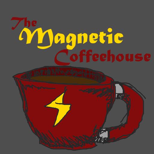
what about MINE? mine is the VERY BEST
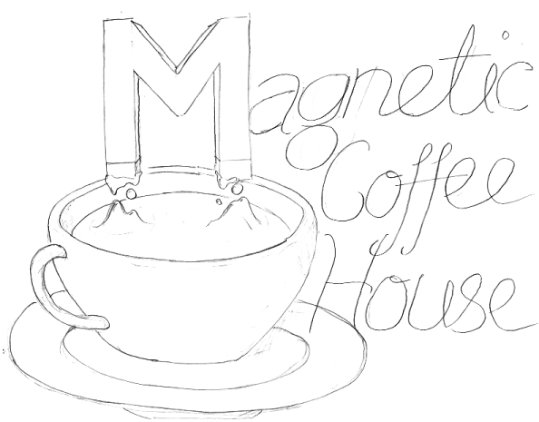
||||||||||||||||||||
2005-06-11, 9:34 PM #33
I'd edit mine for ya, but I don't know the fonts that Kyle used.

Whatever font he used for "Magnetic" is really sexy, though. I want it.
"Art is a lie that makes us to realize the truth."
- Pablo Picasso

blog thingamajig
2005-06-11, 9:44 PM #34
Actually, it wasn't a font, I just drew it by hand...:o

Anyways, I just copied that over onto the other picture. Hope this works for ya :)

[http://img150.echo.cx/img150/8585/magneticcoffeehouse30um.jpg]
Stuff
2005-06-11, 9:45 PM #35
That's freaking perfect. What are both of your real names? This is for the logo credit.

Also, Kyle, can you send me a photoshop version so I can color it if I decide the site needs some color? And maybe since that isn't a font, if you could write out 'Open Mic' and 'Poetry Slam' in the same style, I'd love you long time forever.
ᵗʰᵉᵇˢᵍ๒ᵍᵐᵃᶥᶫ∙ᶜᵒᵐ
ᴸᶥᵛᵉ ᴼᵑ ᴬᵈᵃᵐ
2005-06-11, 9:57 PM #36
Yay! *adds "graphic designer" to resume*

I'm about to e-mail you the .psd, but I didn't do it in photoshop so it's rasterized and doesn't have any layers or anything... I guess it's still better than a .jpg though.

Oh, and my real name is Kyle Buchanan.

Edit: sure, I'll see if I can write those out, but seeing as the font was based off Achelois' drawing in the first place I don't know how well it will turn out. But i'll give it a shot.
Stuff
2005-06-11, 10:19 PM #37
Buahaha, we are quite the enigmatic duo.

I wish that was a font, I love it.

I'm Jennifer Wrubleski, btw.

And if it helps any, Kyle... here's some more of my crappy handwriting for ya.
Attachment: 5438/openmic.jpg (41,981 bytes)
"Art is a lie that makes us to realize the truth."
- Pablo Picasso

blog thingamajig
2005-06-11, 10:23 PM #38
I like the "offee" font from Achelois's better (the bolder one). It seems to fit better. I'd suggest using that over the current one. Here's what I'm suggesting:
Attachment: 5439/magneticcoffeehouse30um.jpg (39,658 bytes)
If you choose not to decide, you still have made a choice.

Lassev: I guess there was something captivating in savagery, because I liked it.
2005-06-11, 10:24 PM #39
Sarn wins.
2005-06-11, 10:27 PM #40
well... Hardly. I just waltzed in a did a quick cut and paste. Obviously, I take no credit for that. :)
If you choose not to decide, you still have made a choice.

Lassev: I guess there was something captivating in savagery, because I liked it.
12

↑ Up to the top!