Massassi Forums Logo

This is the static archive of the Massassi Forums. The forums are closed indefinitely. Thanks for all the memories!

You can also download Super Old Archived Message Boards from when Massassi first started.

"View" counts are as of the day the forums were archived, and will no longer increase.

ForumsDiscussion Forum → Help Manage WPYO
12
Help Manage WPYO
2006-07-03, 4:25 AM #1
Mbeggar, being the busy art-dork he is had to drop out of the whole joint ownership thing for Who Pissed You Off.

Now, this kind of has me stuck.

As it was to work, he was going to take care of the technical side of things and I was going to just make sure everything ran smoothly, and manage the community and front page.

So I need someone to help me.

As someone who will be doing me an awesomely large favor you can expect me to possibly no longer dislike you. Hahaha.

No really, anyone other than kirby want to help? (I like not letting him help, because he complained about wanting to be an admin so much)


I need someone that can/will;

Update the forums or show me how
Install mods for the forums to make things easier or show me how
Help me re-design the front page
Move away from blogger.com (Thinking about installing the livejournal software. The site gets so little traffic anyways, and I already have it paid for untill almost this time next year.. And I don't like the idea of being in two places at once. Would rather have everything on ONE server.)
Help stick all of the old frontpage posts into whatever new blogging software I decide to use


Also, I decided I hate the websites name. Too ****ing long.

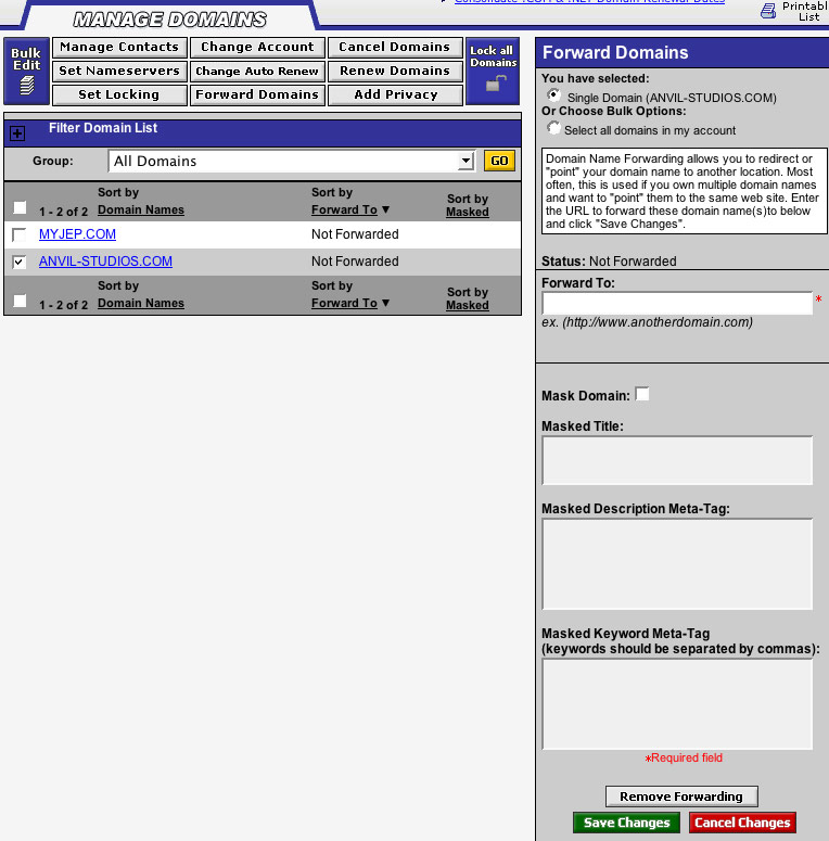
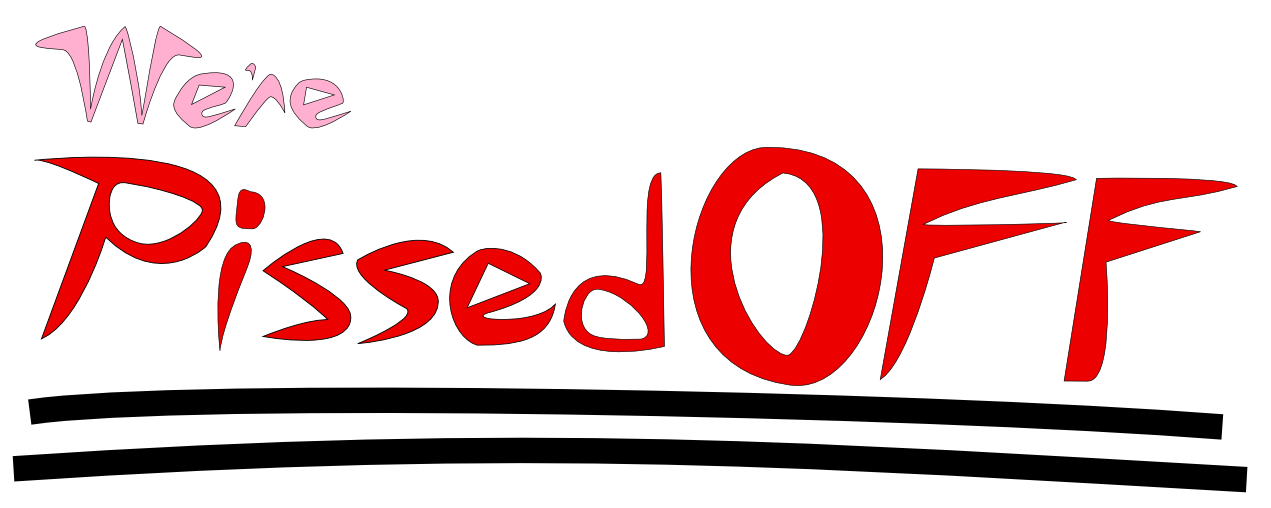
So I've decided to change it to "We're Pissed Off!" I already have werepissedoff.net registered. (Although, I haven't figured out how to direct it to the site yet.. :(

I hope to attract a much younger (My age) audience.

I'm getting pretty okay at vector art. Found a nice free program called Inkscape, so I'm going to try to put together a new logo.
2006-07-03, 4:43 AM #2
I am no longer ****** off any more.

Sorry Rob.
2006-07-03, 4:44 AM #3
Just generally pissed, huh?
Sorry for the lousy German
2006-07-03, 4:56 AM #4
I can't figure out how to get it to ****ing forward the domain to the website. :(

I want werepissedoff.net to send you to where whopissedyouoff.com and can't figure it out. >:(

Told you guys I suck at this ****.
2006-07-03, 4:57 AM #5
I like Who Pissed You Off. It's like the site is out to kick *** or something.
SnailIracing:n(500tpostshpereline)pants
-----------------------------@%
2006-07-03, 4:59 AM #6
Well, I am keeping that domain as well.

I mean, they're like $10 a year a piece. Not bad if you ask me.
2006-07-03, 5:04 AM #7
I think you have to beat the server into submission, tis all.
Was cheated out of lions by happydud
Was cheated out of marriage by sugarless
2006-07-03, 5:05 AM #8
Anyone else use Godaddy?

I've been looking for a setting to direct the domain somewhere but cannot find one, and it's PISSING ME OFF.
2006-07-03, 5:09 AM #9
i use it but I'm no pro.

Did you set up your dnsserve?
Was cheated out of lions by happydud
Was cheated out of marriage by sugarless
2006-07-03, 5:10 AM #10
How do I do that?

I just want to like, find the setting for whopissedyouoff.com and copy ot to werepissedoff.net and be done this ****. :P
2006-07-03, 5:30 AM #11
I can make things pretty, once I have my computery thing back.
Detty. Professional Expert.
Flickr Twitter
2006-07-03, 5:54 AM #12
Originally posted by Rob:
How do I do that?

I just want to like, find the setting for whopissedyouoff.com and copy ot to werepissedoff.net and be done this ****. :P


Did you check out

My Account > Manage Domain Forwarding?

I'll be frank with you, though, I don't know this **** anymore than you. The nameserve (I wrongly called it DNSserve earlier) is in the Manage Domain section. You'll find it in the right table under Nameserve summary.


This would be the Manage Domain Forwarding screen :
Attachment: 12874/serv.jpg (100,499 bytes)
Was cheated out of lions by happydud
Was cheated out of marriage by sugarless
2006-07-03, 6:00 AM #13
Originally posted by Detty:
I can make things pretty, once I have my computery thing back.


I'm working on different logos now.


Also, I think I figured it out, but it wants me to wait upto 48 hours.

We'll see then. It's no real rush at this point, because I have most of the day off today.
2006-07-03, 6:01 AM #14
Yea, your dns needs to update, and it can take a while
Was cheated out of lions by happydud
Was cheated out of marriage by sugarless
2006-07-03, 7:01 AM #15
This is what I came up with for the text part of a logo.


I have no idea what I'm going to put for a visual logo part of it.

I plan to have this guy, in like the top left hand corner, much smaller of course. And then stretching next to it some sort of image that I'll create.

Maybe a bunch of erupting volcanoes or some ****.

Edit: Fixed
Attachment: 12884/pissedoff2.png (79,298 bytes)
2006-07-03, 7:13 AM #16
I would personally ditch the pink color and those uber black strokes of doom. Maybe replace them in one single stroke that varies in width (thin to wide) and have the "pissed off" from the curve of the stroke.

As for visual logo, you should have someone kicking a face in.
Was cheated out of lions by happydud
Was cheated out of marriage by sugarless
2006-07-03, 7:14 AM #17
a beaker of blood and a flame.

red is good, text is icky.

the current site is blue, which is bad. blue is the ultimate neutral colour.

I have a few ideas but I can't do anything with them because this computer sucks :(
Detty. Professional Expert.
Flickr Twitter
2006-07-03, 7:14 AM #18
I wanted the "We're" to be a nice neuteral, non-threatening soft color. And pink was the only thing like red I could think of.

Any other suggestions?
2006-07-03, 7:22 AM #19
Kill the black border around the text. It looks horrible. It either has to be bigger, or not there at all.
2006-07-03, 7:48 AM #20
Jepman: I liked yout suggestion, so I used it.
CoolMatty: The lines were more of a temporary guide for me. But I liked thicker lines after I tried it so they stayed. :)

Getting better?

Keep in mind, I'm learning while I'm doing this. So it may take me a while to figure out how to tweak something.

It's REALLY important to me to have the word part of it be "hand-made."
I don't want some crap someone could have made in 32 seconds in the text art section of photoshop.

Edit: Fixed, again.
Attachment: 12887/pissedoff3.png (91,692 bytes)
2006-07-03, 7:59 AM #21
PS, click for current full size. The forced resizing makes it look pixelated. :(

(I can choose to scale it down when I export it.. I just choose not to out of lazyness.)
2006-07-03, 8:14 AM #22
Wait, since when does WPYO not belong to Dave?
2006-07-03, 8:14 AM #23
How would it look if you gave Pissed a bigger P (match the OFF text) and put the "We're" in the space above issed?

Its getting better.
Was cheated out of lions by happydud
Was cheated out of marriage by sugarless
2006-07-03, 8:19 AM #24
Originally posted by Shintock:
Wait, since when does WPYO not belong to Dave?


Since I bought it from him.
2006-07-03, 8:39 AM #25
The first one is it in it's large form.

The second, should give you an idea of about what size I'd like it to be on the front page.

I might just put a big one in the top center, and then have a bunch of buttons underneath of the arc part of it.

OH, and I made the stroke a little thicker on the P and the O, and I screwed around with the first f a little to make it match a little better.

I think the i is what turned out the best.
Attachment: 12890/pissedoff6.png (71,634 bytes)
Attachment: 12891/pissedoff5.png (25,152 bytes)
2006-07-03, 8:45 AM #26
i like it.
"NAILFACE" - spe
2006-07-03, 8:59 AM #27
Thankyou. :)

You guys have been awesome, is there anything else you think I should do?
2006-07-03, 9:01 AM #28
Your latest version looks better to me than your first one.
"it is time to get a credit card to complete my financial independance" — Tibby, Aug. 2009
2006-07-03, 9:13 AM #29
At seb's request;

Made the red darker, and the lighter pink color a less piggly color.
Attachment: 12892/pissedoff7.png (71,720 bytes)
2006-07-03, 9:51 AM #30
I think its looking pretty good. If you allow me some nitpicking, the only thing I'd do is lower the curved stroke to put the same distance between that and the bottom of the pissed off text and the We're and the top of the issed.

That might sound confusing. :psyduck:
Was cheated out of lions by happydud
Was cheated out of marriage by sugarless
2006-07-03, 10:05 AM #31
No, it didn't, lower the line so that it matches the distance between were and issed.
2006-07-03, 10:09 AM #32
Reminds me of the Pizza Hut logo.
Star Wars: TODOA | DXN - Deus Ex: Nihilum
2006-07-03, 10:10 AM #33
Originally posted by Rob:
No, it didn't, lower the line so that it matches the distance between were and issed.


Exactly. I guess I took the long way of explaining it >.<
Was cheated out of lions by happydud
Was cheated out of marriage by sugarless
2006-07-03, 10:27 AM #34
This just in: Rob sucks at making logos.

You should hire Gold.
2006-07-03, 10:50 AM #35
Originally posted by tofu:
You should hire Gold.


:v:
ORJ / My Level: ORJ Temple Tournament I
2006-07-03, 11:10 AM #36
The log looks a bit...rough. If you want I could help you smooth it out, but if that's the look you're goin for, that's good too.

As far as managing...good luck with that. :P
D E A T H
2006-07-03, 12:59 PM #37
I hate the new name. WPYO.com would have been a better idea.
ᵗʰᵉᵇˢᵍ๒ᵍᵐᵃᶥᶫ∙ᶜᵒᵐ
ᴸᶥᵛᵉ ᴼᵑ ᴬᵈᵃᵐ
2006-07-03, 1:00 PM #38
Yeah, I agree that "Who Pissed You Off" is a better name.
D E A T H
2006-07-03, 2:35 PM #39
The name is just too long and whiney.
2006-07-03, 3:51 PM #40
Originally posted by Rob:
The name is just too long and whiney.

Who Pissed you Off.

Cons:
- 4 syllables
- 4 words

Pros:
- slightly longer, but sounds cooler, and also asks a question, a good thing for people coming to a site (who will almost certainly relate to the question), where they want an answer.

We're Pissed Off.

Pros:
- 3 syllables
- 3 words

Cons:
Just doesn't sound as cool as the first one. It's slightly shorter, but doesn't give the same satisfaction as the other title. With "Who Pissed you Off?" you're inviting a guest to come onto the forums and rant about who pissed them off. But who wants to go to a site called "We're pissed off?"

CONCLUSION: People don't want to talk to pissy people, they want to talk pissy to other people.
My JK Level Design | 2005 JK Hub Level Pack (Plexus) | Massassi Levels
12

↑ Up to the top!