Massassi Forums Logo

This is the static archive of the Massassi Forums. The forums are closed indefinitely. Thanks for all the memories!

You can also download Super Old Archived Message Boards from when Massassi first started.

"View" counts are as of the day the forums were archived, and will no longer increase.

ForumsDiscussion Forum → Readability
Readability
2009-03-20, 9:39 AM #1
You know how most news/information/tutorial sites nowadays have crappy designs full of adds and crap you don't care about? And how it's really painful to just read the damn article because of all the distracting crap that has a font size 85x that of the article itself? And how they use crappy 4-8 column designs so they can fit 7 columns of banners for each one column of content? Well I came across this really cool "bookmarklet" that instantly fixes crap like this. It seems like magic. It's worked on 99% of the sites I've tried it on. Amusingly, Massassi is one where it doesn't really work (I think the frames trip it up).

http://lab.arc90.com/experiments/readability/

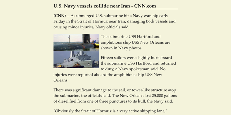
Just for fun, here are before and after screenshots of some random article on cnn.com. Please note, I went to the article on cnn.com, then clicked my "Readability bookmarklet" and it magically did this.
Attachment: 21556/before.png (163,690 bytes)
Attachment: 21557/after.png (178,303 bytes)
2009-03-20, 9:45 AM #2
Very cool. They also make a website for mobile phones that translates script heavy sites like gamespot and cnet into mobile versions. Much the same as this does for desktops. Defenitely bookmarking this one.
"They're everywhere, the little harlots."
-Martyn
2009-03-20, 9:49 AM #3
Nice.
I totally hate the huge ads in the middle of the article, and then the 5 page articles. Dammit I don't want to click NEXT after 4 short paragraphs.
2009-03-20, 10:35 AM #4
Yeah it's pretty annoying; I actually drew a diagram the other day indicating my annoyance at webpage layouts.

[http://kyle90.info/images/layoutsucks.png]
Stuff
2009-03-20, 12:58 PM #5
Originally posted by kyle90:
Yeah it's pretty annoying; I actually drew a diagram the other day indicating my annoyance at webpage layouts.


It's cuz unfortunately "mainstream" users and businesses are still living in the Stone Age and running 1024x600 (or even 1024x768) resolutions and so the "maximum" content width has to be 1024 pixels or fewer. Woot was bold enough to start out with a 1280 width in their page design and there were 40 pages of *****ing about how Woot wasn't cool anymore, how it doesn't care about the customer, how because so many customers were complaining about the horizontal scroll they should listen, how they were becoming too corporate, blah blah blah (I think I actually posted a thread about it). Very very annoying, especially because keeping the width so narrow is very limiting from a design poitn of view.
一个大西瓜
2009-03-20, 1:01 PM #6
It's not really the stone age. Numerous netbooks for instance do not run at very high resolutions.
2009-03-20, 1:05 PM #7
It's understandable for portable computers (my incoming x61t runs at 1024x) but I am pretty sure that the 'majority' of these instances aren't offices full of netbooks or 12" screens but rather people who don't like to upgrade. Which is fine too, I guess -- but at some point technology just becomes obsolete. I mean, I swear monitor resolution was up to standard 1280xsomething by 2003.
一个大西瓜
2009-03-20, 1:05 PM #8
I don't mind the narrow articles .. You know .. uh.. those things .... NEWSPAPERS have been doing it for a hundred years.
2009-03-20, 1:07 PM #9
Originally posted by Pommy:
It's understandable for portable computers (my incoming x61t runs at 1024x) but I am pretty sure that the 'majority' of these instances aren't offices full of netbooks or 12" screens but rather people who don't like to upgrade. Which is fine too, I guess -- but at some point technology just becomes obsolete. I mean, I swear monitor resolution was up to standard 1280xsomething by 2003.


And also these are the same people who are still running XP (or even 98) and IE6 which adds like another level of frustration to the development process because IE6 is cool and doesn't give a **** what other browsers think.

Originally posted by Squirrel King:
I don't mind the narrow articles .. You know .. uh.. those things .... NEWSPAPERS have been doing it for a hundred years.


It's natural to read a tall, narrow column of text (papers, books, almost everything in print is more long than it is wide). Unfortunately, computer screens are tending to be more and more widescreen (probably because of multimedia + movies + companies wanting to save money?) so it's not as conducive to reading in the first place because you can't see as much vertical content and you often have to scroll to see the whole page. Making the content area narrower just makes the scroll worse :mad:
一个大西瓜
2009-03-20, 1:08 PM #10
Originally posted by Pommy:
It's understandable for portable computers (my incoming x61t runs at 1024x) but I am pretty sure that the 'majority' of these instances aren't offices full of netbooks or 12" screens but rather people who don't like to upgrade. Which is fine too, I guess -- but at some point technology just becomes obsolete. I mean, I swear monitor resolution was up to standard 1280xsomething by 2003.


In offices most people have LCDs with a native resolution of 1280x1024, running at 800x600. :suicide:
2009-03-20, 1:32 PM #11
I still prefer my browser to be at a primitive 800x600, because I like to have the other space open for other programs (like IRC chatrooms) to see at the same time without too much over-lapping. I also still use XP because it still works for my purposes. And while I don't use IE anymore, I never had a problem with it when I did use it.

Some of us just want to be able to type documents and check e-mail without having to update to something completely different every six months. I find it frustrating when web designers flat-out ignore supporting certain browsers, particularly IE, because it makes their lives more difficult, even though half the population uses it.

But anyway, about this thread, that's a pretty neat thing there, Brian. Readability for the win.
The Plothole: a home for amateur, inclusive, collaborative stories
http://forums.theplothole.net
2009-03-20, 1:39 PM #12
IE7 is fine. IE8 (which was just released) is even better. It's just IE6 that is a huge pain in the *** and in some cases provides literally no way to do what you want to do (for instance: drop-down boxes are controlled by the OS and not by IE6 itself so they have z-indexes of infinity and will always clip over anything that's supposed to be positioned over them. Minor inconvenience, maybe, but it does get annoying -- example: I had a form with some popup tooltips for some fields. The SELECT field bled through them in IE6. Solution: reposition ALL of the tooltips using inline styles to "dodge" the select fields. :carl:)

And I dunno haha. I run my browser full-screen all the time :P even on my 1920x1080 HDTV.
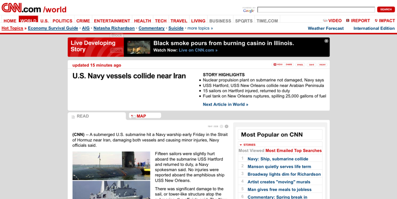
I'm not really blaming the end-user/consumer, I'm expressing my frustration with the fact that certain organizations (e.g. Microsoft, people who make monitors. Hahah.) create an environment in which it's most common and "easiest" to run your computer in a way that makes things hard for content-producers despite efforts to the contrary by many other organizations in the same field. It's not your fault that IE6 works great for you, it's MS's fault for making it ****ing stupid to develop for.
一个大西瓜
2009-03-20, 2:06 PM #13
What's with all those forums that don't re size to your screen resolution and seem to be designed by a person who hasn't heard of any resolution higher than 640x480? It drives me crazy.

↑ Up to the top!