Massassi Forums Logo

This is the static archive of the Massassi Forums. The forums are closed indefinitely. Thanks for all the memories!

You can also download Super Old Archived Message Boards from when Massassi first started.

"View" counts are as of the day the forums were archived, and will no longer increase.

ForumsDiscussion Forum → CS3 (Adobe) Help - Calling Graphic Artists/Designers!
CS3 (Adobe) Help - Calling Graphic Artists/Designers!
2010-10-07, 10:29 AM #1
I've been asked to design a simple logo for a friend who's starting his own business. I have 'some' ability with the CS3 tools, but I can't seem to find a way to do this easily. If anyone can assist, I would greatly appreciate it.

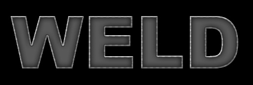
Basically, I need to learn an easy way to make letters (or a font) designed to look like finished welds. To clarify, picture:

[http://t0.gstatic.com/images?q=tbn:nP9MApc35GCiqM:http://www.jeepsunlimited.com/forums/attachment.php?attachmentid=38799&d=1203176964&t=1]

It needs that pattern that a good weld has. I don't think it's within my knowledge to create one from scratch, and google searching has only brought me topics on actual welding or something called 'welded text' which I think is something entirely different.

Anyone?
Quote Originally Posted by FastGamerr
"hurr hairy guy said my backhair looks dumb hurr hairy guy smash"
2010-10-07, 10:39 AM #2
?
Attachment: 24399/weld.jpg (28,075 bytes)
TAKES HINTS JUST FINE, STILL DOESN'T CARE
2010-10-07, 11:01 AM #3
Try making a normal metal texture and then use the smudge tool set to a high hardness and make little smudges starting from the direction they'll be going so you can overlap and get the "ringed" effect. I don't know if that'd work though. I've never done anything like that. I suppose then you could make a line element out of that in Illustrator and make the text there.
ᵗʰᵉᵇˢᵍ๒ᵍᵐᵃᶥᶫ∙ᶜᵒᵐ
ᴸᶥᵛᵉ ᴼᵑ ᴬᵈᵃᵐ
2010-10-07, 11:05 AM #4
Hmm, not a bad idea, but wouldn't it look kinda flat if I used smudge? I can't test this yet because I'm not at home.

Roger, Sorry but that's just not what I'm looking for. Thanks though.
Quote Originally Posted by FastGamerr
"hurr hairy guy said my backhair looks dumb hurr hairy guy smash"
2010-10-07, 11:18 AM #5
Yes, ignore Zully when it comes to photoshop and design. Brilliant.
>>untie shoes
2010-10-07, 11:21 AM #6
He's not ignoring him, zul just didn't produce what he's asking for.
2010-10-07, 11:25 AM #7
I know, I'm just being a dick.
>>untie shoes
2010-10-07, 11:50 AM #8
A good logo can be displayed entirely with black and white. Not grayscale, but 2-tone black and white. Or at least as few shades as possible. It needs to look good on any medium.
Bassoon, n. A brazen instrument into which a fool blows out his brains.
2010-10-07, 12:24 PM #9
Particularly when run through a scanner and fax machine 50 times. Because that's where it'll see a lot of use >.>
2010-10-07, 12:26 PM #10
What I have in mind will be fairly simple, I'll probably end up making a primary logo for future use, and then a modified black and white 2-tone for business cards and business receipts.

I didn't realize Roger was Zully, I can't keep up with all the name changes.
Quote Originally Posted by FastGamerr
"hurr hairy guy said my backhair looks dumb hurr hairy guy smash"
2010-10-07, 12:49 PM #11
The 2-tone logo shouldn't be the modified logo, it should be the primary logo that you design first. Worry about a pretty colored version for the website or whatever after you have the proper design.
Bassoon, n. A brazen instrument into which a fool blows out his brains.
2010-10-07, 12:57 PM #12
Originally posted by KOP_AoEJedi:
I didn't realize Roger was Zully, I can't keep up with all the name changes.


whoa! i did not realize that either! :o

lol, on a whim ityped in "zully textures" into google and this gem came up:
http://www.seriouszone.com/forums/showthread.php?52938-the-birth-of-a-texture&p=808905
Welcome to the douchebag club. We'd give you some cookies, but some douche ate all of them. -Rob
2010-10-07, 1:16 PM #13
Originally posted by Emon:
The 2-tone logo shouldn't be the modified logo, it should be the primary logo that you design first. Worry about a pretty colored version for the website or whatever after you have the proper design.


Well, it seems like it would be the same either way, since the 2-tone is just going to be a cutout version of the logo. Even the 'nice' logo won't be too fancy.
Quote Originally Posted by FastGamerr
"hurr hairy guy said my backhair looks dumb hurr hairy guy smash"
2010-10-07, 1:27 PM #14
I know that's not what you were looking for. That's precisely why I did it. :neckbeard:
TAKES HINTS JUST FINE, STILL DOESN'T CARE
2010-10-07, 1:27 PM #15
Also I like that link.
TAKES HINTS JUST FINE, STILL DOESN'T CARE
2010-10-07, 1:28 PM #16
TEH SERIOUS ZONE

business is rough
Star Wars: TODOA | DXN - Deus Ex: Nihilum
2010-10-07, 1:36 PM #17
Originally posted by KOP_AoEJedi:
CS3 (Adobe) Help

Sorry I only have CS4 guess I can't help
Bassoon, n. A brazen instrument into which a fool blows out his brains.
2010-10-07, 1:37 PM #18
Didn't know that Roger was Zully either.

I was always damned impressed by most of the textures posted in Showcase (by him and/or by others), even if I usually didn't comment as I had nothing constructive to add. :)
幻術
2010-10-07, 1:46 PM #19
Okay so as Emon pointed out asking for 'CS3 advice' is oddly specific. Close the program and grab a pencil and paper.

Look here and pay attention to what makes these logos look nice:
http://abduzeedo.com/tags/logo

Then go here and make sure your logo won't end up here one day:
http://yourlogomakesmebarf.com/

Compare, contrast, do whatever. Just don't start off by saying "I NEED A WELDING FONT FOR A LOGO"
[01:52] <~Nikumubeki> Because it's MBEGGAR BEGS LIKE A BEGONI.
2010-10-07, 2:23 PM #20
Everytime I hear of some ambitious business guy trying to get free work out of a graphic designer, I think of this and this. :psyduck:
"I'm afraid of OC'ing my video card. You never know when Ogre Calling can go terribly wrong."
2010-10-07, 2:39 PM #21
Hahahahah those are awesome
I tend to think of this: http://clientsfromhell.net/
[01:52] <~Nikumubeki> Because it's MBEGGAR BEGS LIKE A BEGONI.
2010-10-07, 7:19 PM #22
Haha, never heard of that site. The Oatmeal does some funny comics on idiot clients too.
"I'm afraid of OC'ing my video card. You never know when Ogre Calling can go terribly wrong."
2010-10-08, 5:39 AM #23
I only mentioned CS3 so you would be aware of what tools I have. I guess I am just not very good at explaining in detail what I have in my head. Unfortunately I had a LOT of cleaning to do at my house yesterday and didn't get around to working on this thing.
Quote Originally Posted by FastGamerr
"hurr hairy guy said my backhair looks dumb hurr hairy guy smash"
2010-10-08, 6:25 AM #24
:hist101:
Attachment: 24404/weld2.jpg (57,276 bytes)
TAKES HINTS JUST FINE, STILL DOESN'T CARE
2010-10-08, 8:40 AM #25
Hmm, similar to what I'm looking for, only that looks like a really inexperienced welder :D
Quote Originally Posted by FastGamerr
"hurr hairy guy said my backhair looks dumb hurr hairy guy smash"

↑ Up to the top!