Massassi Forums Logo

This is the static archive of the Massassi Forums. The forums are closed indefinitely. Thanks for all the memories!

You can also download Super Old Archived Message Boards from when Massassi first started.

"View" counts are as of the day the forums were archived, and will no longer increase.

ForumsDiscussion Forum → New Massassi Design feedback?
New Massassi Design feedback?
2019-05-02, 6:11 PM #1
I've been working on a new design and am curious what everyone thinks. (This is for the main page, not the forums right now.) Note that all the links point to the "old" stuff so it's just the main page design I'm worried about. I tested in Firefox, Safari, Vivaldi(chrome-ish), and mobile Safari and it looks mostly ok (there's a small issue at the very bottom on mobile but not really worth fixing). I don't expect it to work on IE because it's using CSS grid which isn't supported. I don't really care, cuz IE sucks. As you can see I've become much better at design since 1998.

https://www.massassi.net/newdesign/

The main changes are that it's no longer using frames or tables for layout and all the styling has been pulled out into css. It should be a lighter page (not that it was really heavy anyway) and maybe search engines won't croak when they see the frames.

Visually some of the fonts are a bit bigger and I darkened the white font a tiny bit because it's supposedly easier on the eyes.
2019-05-02, 8:02 PM #2
Looks good to me. I had to double check that I was looking at the new page and not the old one. I can offer no technical feedback, but visually it seems fine.
2019-05-03, 2:06 AM #3
Looks good. Any plans to make it more mobile friendly? I mean, it works, but the links are a little small on a small display.
Sorry for the lousy German
2019-05-03, 6:58 AM #4
Yes. I'm not sure exactly what I'll do, though... make the menu horizontal maybe. I have an older version here: https://www.massassi.net/noframes/

But I wasn't happy with it; it relied on some js libraries and those seem to be created, get used for a year, and then nobody ever touches them again, basically leaving maintenance to me and I don't want to take on anything else. In that older one the menu would turn into a hamburger menu on a phone.
2019-05-03, 7:02 AM #5
(and yep, just checked, the one I used "Pure" is already lagging and they're begging for maintainers)
2019-05-03, 7:43 AM #6
Mobile friendly would be nice, but the value of being able to read JK editing tutorials on your smartphone seems narrow. The redesign seems fine to me. I'm not sure what changed though.
2019-05-03, 8:26 AM #7
JavaScript is nowadays advanced enough that you don't need any fancy library. And I'd say a hamburger menu is simple enough to implement even with old-school JavaScript.
Just have the button show up only on mobile and hide the menu by default on mobile and use JavaScript to toggle the menu visibility on click. No need for any template shenanigans.
Sorry for the lousy German
2019-05-03, 1:31 PM #8
Looking good on Firefox 60.6.61esr
2019-05-03, 6:56 PM #9
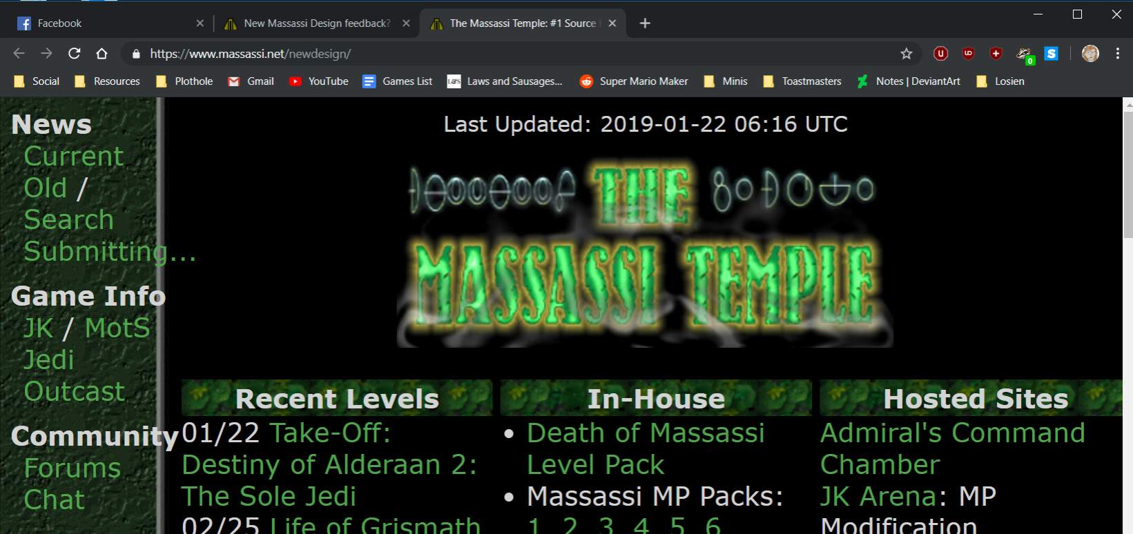
I'm using Chrome Version 74.0.3729.131 (Official Build) (64-bit) and it seems the menu options on the left bleed out of the 'column' so to speak.

The Plothole: a home for amateur, inclusive, collaborative stories
http://forums.theplothole.net
2019-05-03, 7:41 PM #10
Do you have your default zoom set high? Or default font size increased from stock? I checked chrome at 1080p and it looks great at default zoom.

It also looks like maybe your browser window width is small, can you try increasing it? How many pixels across is your window?
2019-05-03, 7:42 PM #11
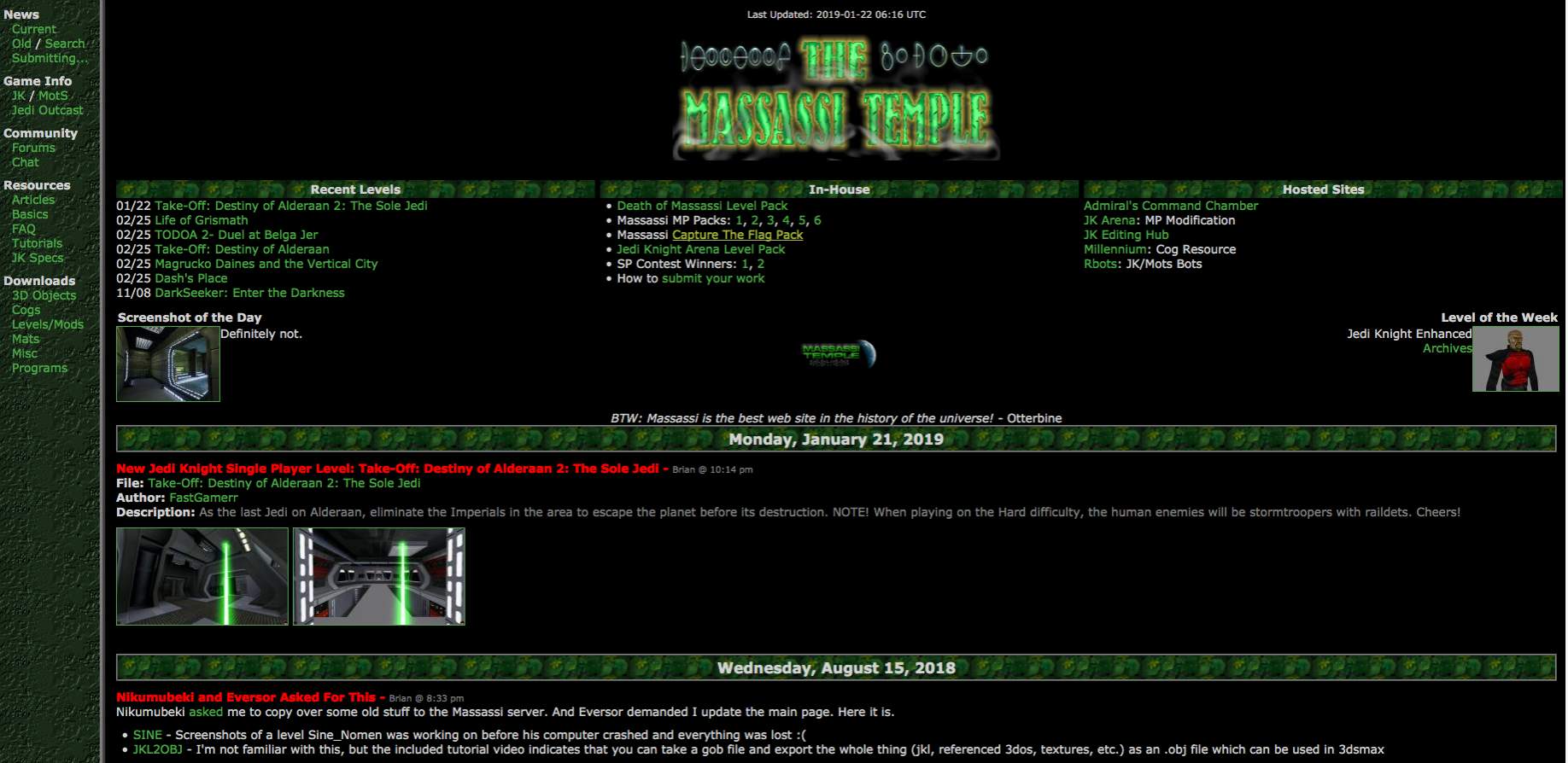
This is how it's supposed to look.

2019-05-05, 11:43 AM #12
Originally posted by Brian:
Do you have your default zoom set high? Or default font size increased from stock? I checked chrome at 1080p and it looks great at default zoom.

It also looks like maybe your browser window width is small, can you try increasing it? How many pixels across is your window?


Apologies, yes, my default font size is set larger than standard. I do have zoom set higher too, and I tend not to full-screen my browser windows, but only the default font size impacted that issue one way or the other.
The Plothole: a home for amateur, inclusive, collaborative stories
http://forums.theplothole.net
2019-05-05, 1:00 PM #13
I'm A/Bing it on a 4k monitor and I have no complaints, looks great! Fonts are definitely improved.

A minor suggestion, if you're making changes--maybe full dates on the "Recent Levels"? Weird seeing LoG as 02/25 when it's from 02/25/16.
2019-05-06, 7:17 AM #14
Can I suggest the following:

Code:
.caption {
    padding: 0px 5px;
    overflow: auto;
}


Just so the Level Of the Week and Screenshot of the Day captions aren't butted right up against the image.
TheJkWhoSaysNiTheJkWhoSaysNiTheJkWhoSaysNiTheJkWho
SaysNiTheJkWhoSaysNiTheJkWhoSaysNiTheJkWhoSaysNiTh
eJkWhoSaysNiTheJkWhoSaysNiTheJkWhoSaysNiTheJkWhoSa
ysNiTheJkWhoSaysNiTheJkWhoSaysNiTheJkWhoSaysNiTheJ
k
WhoSaysNiTheJkWhoSaysNiTheJkWhoSaysNiTheJkWhoSays
N
iTheJkWhoSaysNiTheJkWhoSaysNiTheJkWhoSaysNiTheJkW
2019-05-06, 3:03 PM #15
Originally posted by 'Thrawn[numbarz:
;1226810']I'm A/Bing it on a 4k monitor and I have no complaints, looks great! Fonts are definitely improved.

A minor suggestion, if you're making changes--maybe full dates on the "Recent Levels"? Weird seeing LoG as 02/25 when it's from 02/25/16.


I can do that.
2019-05-06, 3:04 PM #16
Originally posted by Gebohq:
Apologies, yes, my default font size is set larger than standard. I do have zoom set higher too, and I tend not to full-screen my browser windows, but only the default font size impacted that issue one way or the other.


I think if I do the css right it will work out. When you go to a smaller width hopefully it will give you the "mobile" view instead (smaller viewport I guess). Then it won't be all squished and weird looking, but you'll get blocks stacked vertically instead of horizontally. I'm still working on it. Thanks!
2019-05-06, 3:05 PM #17
Originally posted by Ni:
Can I suggest the following:

Code:
.caption {
    padding: 0px 5px;
    overflow: auto;
}


Just so the Level Of the Week and Screenshot of the Day captions aren't butted right up against the image.


Makes sense, I will add it. Thanks!
2019-05-07, 8:41 PM #18
The dates and spacing suggestions have been added. Still working to make it more mobile-friendly. I need to learn some stuff to make that happen.
2019-05-07, 11:43 PM #19
Ok, I believe I made it more mobile-friendly. Either access it on a phone or shrink your browser window and you can see what it looks like.

Look for the "hamburger" menu in the top left. If you click/tap on it, it will open the menu. Click/tap it again and the menu will close.

The fonts on desktop when you have your browser window at anything less than 1024, look absolutely huge. But they look fine to me on mobile. I don't really know how to make it look good on both.

I completely don't understand how font sizes work anymore. A font size of "1em" or "1.2em" looks great to me on desktop but looks super tiny on my iphone 7. Instead of me trying to figure out what font size to specify for every screen size, why can't I just say "1 'unit of whatever looks good on your screen'"? I'm going to look into this further at some point but if anyone has some tips I would appreciate it.

I finally settled on setting the base font size to "100%" and then using "em" units to shrink/grow fonts on certain elements. The end result is that it looks better on iphone but the fonts grew on desktop/firefox/chrome/etc. I think it's still ok, I'm getting old anyway. If the fonts sizes are bothersome let me know and I can do something.
2019-05-10, 7:37 AM #20
I like it, looks good.
The thing about font sizes is that em is just relative to the base font size. So 1em is more or less the same as 100 %. But the funny thing is that pixels are a relative fontsize. 1px on a mobile device with a high resolution screen might actually be 4 physical pixels. So you can actually use px to set a base font size that should look more or less the same on desktop and mobile.

You should also specify the viewport, it is more or less the universal "my page is mobile ready" indicator. It could also change how the font size is interpreted.
Code:
<meta name="viewport" content="width=device-width, initial-scale=1.0, user-scalable=yes">
Sorry for the lousy German
2019-05-10, 10:32 AM #21
Thanks for the comments and suggestion re: viewport, will get that done.

Regarding font sizes, I thought the opposite was true? I've read so many articles that say "stop using px font sizes" because they interfere with zoom (and some other stuff I don't remember).

I don't really want the font sizes to be "the same" on desktop and mobile, I want them to be readable on desktop and mobile. When they looked good on desktop, they were way too small on mobile. When I raise them up on mobile only (via media query css) it also applies to desktop when you shrink your browser window. Maybe I need some different criteria other than window size that determines which styles you get. It sounds like I'll need 3 options, one for mobile (big fonts, expanding menu), one for desktop with sufficient width (regular fonts, fixed menu), one for desktop with smaller width (regular fonts, expanding menu).
2019-05-10, 4:59 PM #22
Originally posted by Brian:
Thanks for the comments and suggestion re: viewport, will get that done.

Regarding font sizes, I thought the opposite was true? I've read so many articles that say "stop using px font sizes" because they interfere with zoom (and some other stuff I don't remember).

I don't really want the font sizes to be "the same" on desktop and mobile, I want them to be readable on desktop and mobile. When they looked good on desktop, they were way too small on mobile. When I raise them up on mobile only (via media query css) it also applies to desktop when you shrink your browser window. Maybe I need some different criteria other than window size that determines which styles you get. It sounds like I'll need 3 options, one for mobile (big fonts, expanding menu), one for desktop with sufficient width (regular fonts, fixed menu), one for desktop with smaller width (regular fonts, expanding menu).


That last one you mention is what the company I work at generally designs as "tablet view" and probably isn't a bad way to go.
The Plothole: a home for amateur, inclusive, collaborative stories
http://forums.theplothole.net
2019-05-11, 9:14 PM #23
It looks really good and I have no real complaint but one thing I end up doing depending on what size monitor I'm on at a given time is ctrl-scroll wheeling the size higher and lower. When I do it on the new design it scales both frames. I don't even know if this is possible but I wonder if it's possible to just affect the frame the cursor is over. For all I know that's a browser setting somewhere. I just ends up making the left side scale unnecessarily large and wide (if you really zoom in). That's the only thing someone that browses like I do might notice but definitely not a deal breaker.
"I would rather claim to be an uneducated man than be mal-educated and claim to be otherwise." - Wookie 03:16

2019-05-13, 8:28 AM #24
The new design doesn't have frames at all (that was the point). I don't know if there's a way to lock scaling on certain elements but I feel like that would be really bad. I wonder if I could switch to the other stylesheet (the one with the collapsed side menu) when someone zooms. Or something. Probably won't worry about it at this point, I have to modify like every single page on the site to use the new design.
2019-05-13, 6:18 PM #25
My bad, I thought I had read that the other day and then for some reason I thought you had already updated the main page with the new layout. Sorry. In order for the new design to get weird I have to scale unrealistically high. I thought it was strange that the new design would have had a frame!
"I would rather claim to be an uneducated man than be mal-educated and claim to be otherwise." - Wookie 03:16

2019-05-13, 10:03 PM #26
I haven't rolled it out yet; I'm going to have to update a ton of pages and various scripts written in multiple languages so it's a pain. I jumped on tonight to start doing it but then there was an emergency at work... blargh.
2019-05-14, 1:29 AM #27
Would look nicer with the updated screenshots, description and download for T-O: DOA 2, ofc.

:ninja:
Star Wars: TODOA | DXN - Deus Ex: Nihilum
2019-05-14, 7:37 PM #28
Have we really been rocking the same homepage since 1998?
SnailIracing:n(500tpostshpereline)pants
-----------------------------@%
2019-05-16, 7:33 PM #29
It's pretty similar but not exactly the same as it originally was. I think I posted some screenshots somewhere that shows the original design. I'll try to find it at some point. There was originally some graphical buttons in the menu instead of text links, and the logo and buttons and all that were contributed so we didn't start with them. All the blocks of stuff above the news and below the logo weren't there.

↑ Up to the top!