Massassi Forums Logo

This is the static archive of the Massassi Forums. The forums are closed indefinitely. Thanks for all the memories!

You can also download Super Old Archived Message Boards from when Massassi first started.

"View" counts are as of the day the forums were archived, and will no longer increase.

ForumsShowcase → New Website : Dark Jedi (Suggestions welcomed)
New Website : Dark Jedi (Suggestions welcomed)
2008-03-28, 9:18 AM #1
Heya guys, I hadn't dabbled in websites in a long time so I recently decided to put together a little site for the dark jedi character I RP in the Dark Jedi Brotherhood club.

Its a CSS exclusive website, no tables and what not. I've made sure that both the HTML and CSS validated without errors.

Its a rather simplistic design because its a personal, informative website rather than one meant to be visited often. Now I'd welcome suggestions on spicing things up if some find it too boring, or opinions on it as it stands.

Note that there are still sections that are not ready and will come up empty. It is also best viewed in Firefox at 1600x1200 resolution, and works down to a full-screen 1024x768.

If anyone use any other softwares (I'd especially like to know about IE7 since that is a more commun browser for more untrained people. I'd welcome screenshots just to see if everything is aligned. I do know that it doesn't work quite well in IE6 because that browser does not read the min-width value from the CSS.)

The Black Hand's Lair

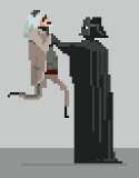
Now to all those who have some good experience with CSS, if you notice the character in the background will slide away from the text table as you reduce the width of your browser (or resolution). After several tries, I have yet found a way to have it stay in the same location relative to the text. The character is currently set as a background.

Any suggestions on fixing this problem?
Was cheated out of lions by happydud
Was cheated out of marriage by sugarless
2008-03-28, 9:50 AM #2
kill the splash page
Bassoon, n. A brazen instrument into which a fool blows out his brains.
2008-03-28, 12:27 PM #3
Yes.

Also, that 'best viewed in' crap is both stupid and pretentious. It tells us one of two things about the web designer. Either he can't make the website work in other browsers, or he's an elitist *** and doesn't care about other browsers.
2008-03-28, 12:35 PM #4
That said, it's pretty good. The red text is a little too dark, and it's hard to read the "Cyris Oscura" heading. Said heading also looks obviously photoshopped.

Also where is my Dark Jedi HUD? :colbert:
Bassoon, n. A brazen instrument into which a fool blows out his brains.
2008-03-28, 12:40 PM #5
Originally posted by JM:
Yes.

Also, that 'best viewed in' crap is both stupid and pretentious. It tells us one of two things about the web designer. Either he can't make the website work in other browsers, or he's an elitist *** and doesn't care about other browsers.


CSS stylesheets are worthless in IE6. It doesn't support max-width and whatnot. I know how to cheat my CSS so it does work (]width:75%) but then my CSS does not validate. I prefer to validate than support Microsoft ****, thus I put the warning. For all the other browsers I've tried out it works, and having no access to IE7 so I don't know if its better than its previous version.

Also : I will lighten the header and text a bit. What is wrong with looking photoshopped though... I mean, it doesn't look like flat html text...
Was cheated out of lions by happydud
Was cheated out of marriage by sugarless
2008-03-28, 12:42 PM #6
Well I guess i could make the 'Cyris Oscura' part better. I shall.

As for the splash screen : awww i liked the graphic T_T
Was cheated out of lions by happydud
Was cheated out of marriage by sugarless
2008-03-28, 2:37 PM #7
I like it
"Nulla tenaci invia est via"
2008-03-28, 3:03 PM #8
Originally posted by Jep:
I prefer to validate than support Microsoft ****, thus I put the warning.

That's retarded. What is the purpose of having your website validate? All it says is that you're following standards. Sacrificing user experience at the expense of validation is nothing but masturbatory ego stroking and selfish.

Originally posted by Jep:
What is wrong with looking photoshopped though... I mean, it doesn't look like flat html text...

What I mean is that it looks like you applied way too many of the built-in glowy effects. Try to come up with something original instead.
Bassoon, n. A brazen instrument into which a fool blows out his brains.
2008-03-28, 3:47 PM #9
Originally posted by Jep:
As for the splash screen : awww i liked the graphic T_T

It's nice, but splash screens interfere with usability. People are at your website to see the content. A splash screen is just another thing that gets in the way. It doesn't serve any purpose.
Bassoon, n. A brazen instrument into which a fool blows out his brains.
2008-03-28, 3:56 PM #10
Originally posted by Emon:
That's retarded. What is the purpose of having your website validate? All it says is that you're following standards. Sacrificing user experience at the expense of validation is nothing but masturbatory ego stroking and selfish.


Hmmm, you are right. I always aim to validate my stuff but a few bugs due to fixes aren't that bad a sacrifice. You speak truth.

Originally posted by Emon:
What I mean is that it looks like you applied way too many of the built-in glowy effects. Try to come up with something original instead.


I will indeed work on this

And remove splash screen (;_;)
Was cheated out of lions by happydud
Was cheated out of marriage by sugarless
2008-03-28, 5:01 PM #11
Originally posted by Jep:
I always aim to validate my stuff but a few bugs due to fixes aren't that bad a sacrifice.

Remember that validation is to make sure that your content is correct. It's basically a unit test to see if your content renders properly. If the world was perfect, having a valid site means it would work in every web browser.
Bassoon, n. A brazen instrument into which a fool blows out his brains.
2008-03-28, 6:04 PM #12
Originally posted by Emon:
Remember that validation is to make sure that your content is correct. It's basically a unit test to see if your content renders properly. If the world was perfect, having a valid site means it would work in every web browser.


I'm pretty sure as is it works with every recent browser. I know its wider on the IE6 version. It still works but its not the intended width. I wish I had access to IE7 to know if the fixed that. I'm assuming they did.

Anyone here happen to have access to it?
Was cheated out of lions by happydud
Was cheated out of marriage by sugarless
2008-03-28, 6:25 PM #13
Yeah, it looks great in IE7.
Bassoon, n. A brazen instrument into which a fool blows out his brains.
2008-03-28, 7:51 PM #14
Hey look at that. Just fixed the background problem when you reduced the width. The problem was simply the image width itself. *facepalm*

Now to work on the other stuff.
Was cheated out of lions by happydud
Was cheated out of marriage by sugarless
2008-03-28, 8:52 PM #15
Is this new logo any better?

Meh, dunno. Not sure I like it myself. I'll sleep on it.

Thanks for the feedback Emon and all!

Updated : Removed Splash, fixed different browser issues, fixed background character, lightened red text, new "Cyris Oscura" header

Opinions are very welcomed.
Was cheated out of lions by happydud
Was cheated out of marriage by sugarless
2008-03-29, 6:38 AM #16
It's very nice. One thing that would help is bringing the entire body (text and header) closer to the top, so the navigation doesn't begin so far down. I like the way the navigation is aligned with that very authentic quote, so it would be nice to move the whole block instead of the sidebar.
2008-03-29, 7:41 AM #17
Originally posted by herb:
It's very nice. One thing that would help is bringing the entire body (text and header) closer to the top, so the navigation doesn't begin so far down. I like the way the navigation is aligned with that very authentic quote, so it would be nice to move the whole block instead of the sidebar.


Good point. Is this any better? Its higher be nearly 50 pixels.
Was cheated out of lions by happydud
Was cheated out of marriage by sugarless
2008-03-29, 1:27 PM #18
Great. Now for the bigger issue.

What the hell is this? A... character sheet? Stats? (0 wins, 0 losses... ...) Man, you're so amazingly cool!
2008-03-29, 1:48 PM #19
Originally posted by JM:
Great. Now for the bigger issue.

What the hell is this? A... character sheet? Stats? (0 wins, 0 losses... ...) Man, you're so amazingly cool!


Its part of a sw rp club dude. And the 0 0 is because I had my dossier deleted 2 years ago and I just recently had it recreated.
Was cheated out of lions by happydud
Was cheated out of marriage by sugarless
2008-03-29, 1:54 PM #20
Originally posted by JM on the INTERNET:
Man, you're so amazingly cool!

You should stop while you're ahead.
Bassoon, n. A brazen instrument into which a fool blows out his brains.
2008-03-29, 2:17 PM #21
Looks pretty sweet.
Star Wars: TODOA | DXN - Deus Ex: Nihilum
2008-03-29, 3:11 PM #22
Originally posted by Jep:
Good point. Is this any better? Its higher be nearly 50 pixels.


If you make the top of the text (the actual letters, not flame-ish thing) even with the top of the hair, I think it would be ideal.
2008-03-29, 3:16 PM #23
I still think the header is too hard to read. It should be brighter. The Cyris Oscura part, I mean.
Bassoon, n. A brazen instrument into which a fool blows out his brains.
2008-03-30, 3:27 AM #24
Under the heading "A speaker Crackles..." you used the word "world" where I think you meant "worlds."

It looks good though.
2008-03-30, 10:31 AM #25
Looks great in Konqueror at 1024x768.

Just some semantics:
Your continuous text is inside <h1>-tags, but you should definately use <p>-tags for that. And don't end a paragraph with <br /><br />. Enclose each paragraph in <p>-tags and use CSS to set the margins.
Also, as a navigation is essentially just a list of links you should declare it as such. You can use CSS to make it look like it does now by setting display:block on the <li>-tags.
Sorry for the lousy German

↑ Up to the top!