Massassi Forums Logo

This is the static archive of the Massassi Forums. The forums are closed indefinitely. Thanks for all the memories!

You can also download Super Old Archived Message Boards from when Massassi first started.

"View" counts are as of the day the forums were archived, and will no longer increase.

ForumsShowcase → New Massassi Temple Design (no more frames!!)
New Massassi Temple Design (no more frames!!)
2016-02-19, 11:33 PM #1
I've been working tirelessly on a new, modern design for The Massassi Temple. This new design does not use frames. This is important for SEO and general usability. So far I only have the main page working (it will be a while before I can update all the various pages). I used the very latest in web technology so the site is much more modern than before. You should notice the improvement right away.

I would like some feedback so let me know what you think! First I'll post a link to it, then I'll post a screenshot of what it should look like. If you're not seeing it like it should be, please post a screenshot here and describe the problem (and what browser/operating system you are using). I tested this on linux in Firefox and Chrome.


Test site: https://www.massassi.net/noframes/


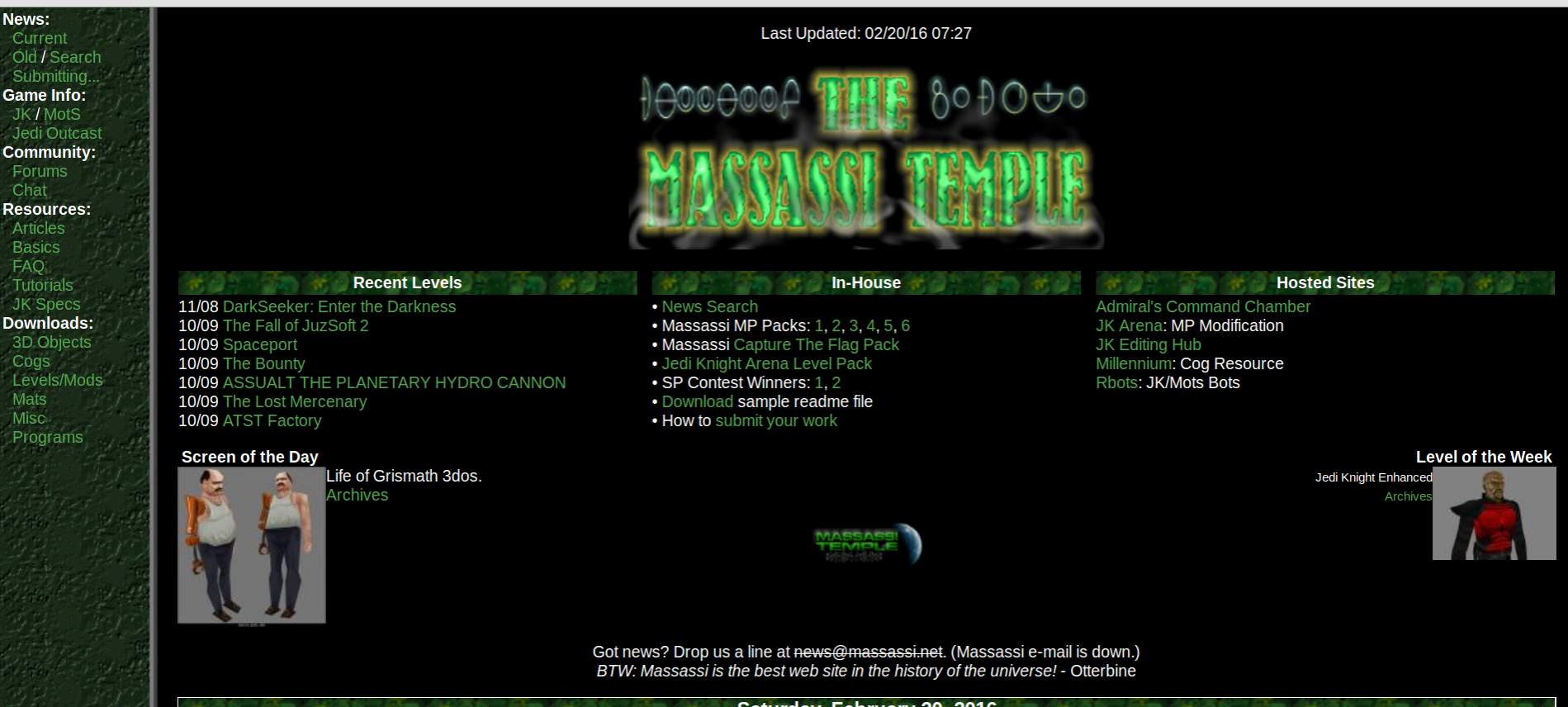
Should look like this:
2016-02-20, 12:22 AM #2
IT LOOKS ABSOLUETLY NOTHING LIKE YOUR SCREENSHOT!!!111

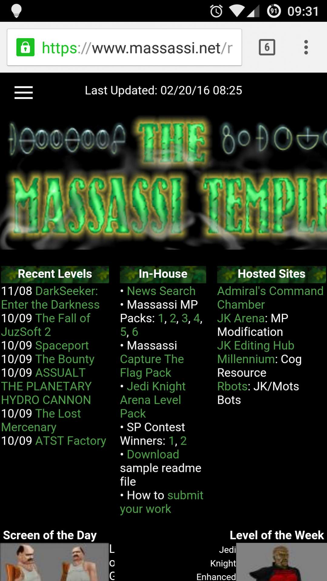
Screenshots are too wide on mobile (Chrome on Android). max-width: 100% for images should do it.
Sorry for the lousy German
2016-02-20, 12:27 AM #3
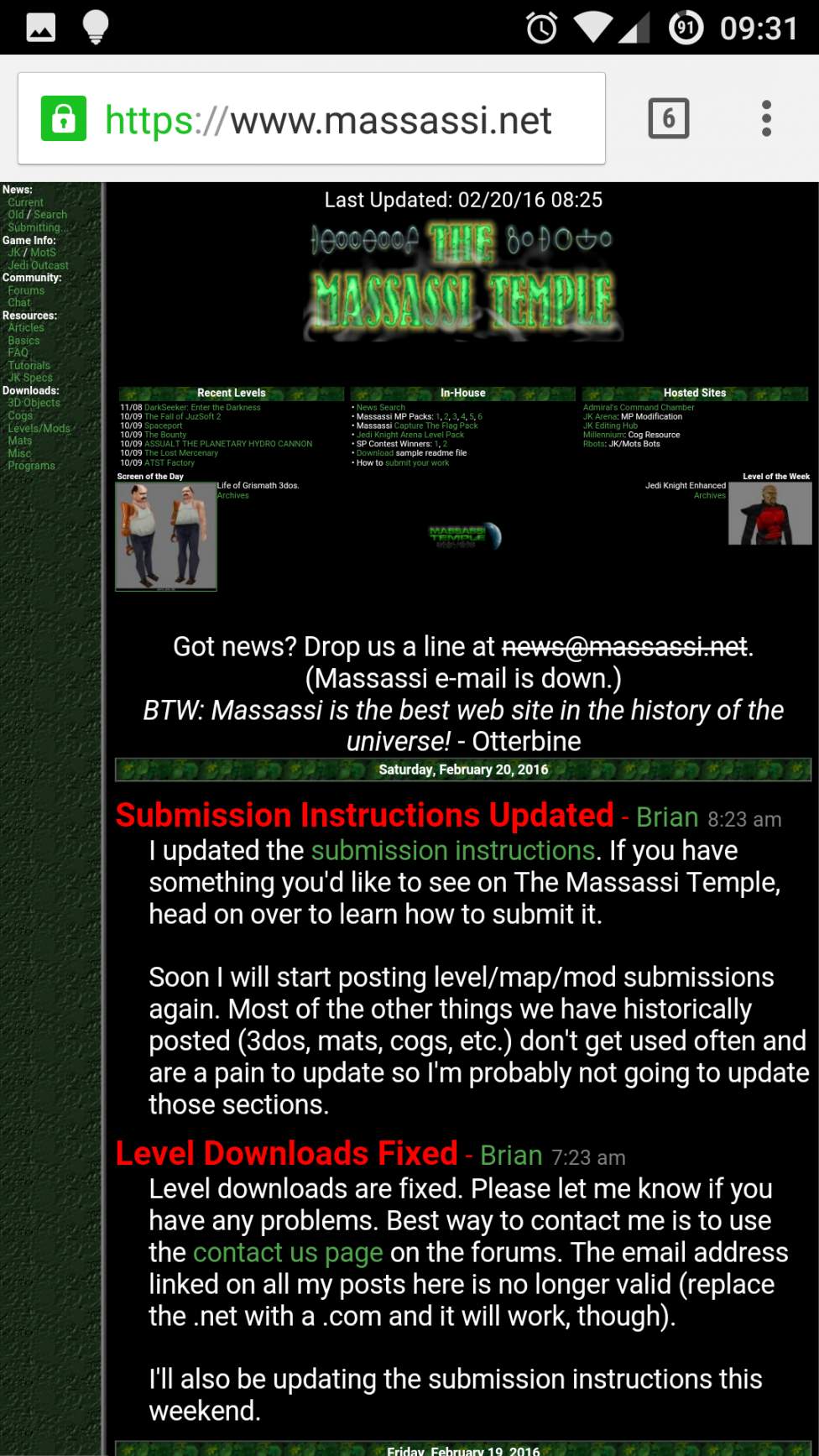
Well crap. How does it compare to the original design on the phone? It looked fine on my iphone (mobile safari) and even has a hamburger menu instead of the side menu.

In any case, I think I set max-width on that image to 100%. Will you reload and see if it helped? Thanks for looking!
2016-02-20, 12:34 AM #4
The logo is still too wide. Interestingly the old layout works better.

Sorry for the lousy German
2016-02-20, 12:50 AM #5
I set max-width on the logo. Yeah I agree the old one looks better. It seems like your browser is automatically scaling the entire page to fit which makes the fonts really small. The new one is actually readable. I'm done for the night, will pick it up again later. Thanks for the help!
2016-02-22, 6:19 PM #6
I smell a logo contest...
2016-02-22, 9:14 PM #7
[https://www.massassi.net/images/logo2.jpg]
2016-02-23, 4:01 PM #8
gross
TAKES HINTS JUST FINE, STILL DOESN'T CARE
2016-02-23, 4:48 PM #9
Hey that's one of our original logos. I really like it. I can't remember who made it though :(
2016-02-23, 8:15 PM #10
The logo looks fine on my phone (Android running Chrome browser) until I open the menu, when that happens the page becomes too big for the phone and scrolls across.

I get some small issues with the SOTD and LOTW section - the text is messed up. Maybe putting them in div's rather than a table would work better so on a wide resolution have them next to each other as they currently are but then on small screen sizes stack down?
2016-02-24, 2:59 AM #11
It'd probably be worthwhile to set up a media query so that, when the width of the viewport is small (<400 pixels), or when you're viewing from a mobile device, the Recent Levels, In-House and Hosted Sites sections stack on top of each other and each fill the whole width of the screen (instead of how it is now, where they each take up about 1/3 of the width).
former entrepreneur
2016-02-24, 7:52 AM #12
Yeah, I wasn't really trying for mobile compatibility (although it looks fine on my iphone). But I will make more improvements before I roll it out to the rest of the site. Thanks for the feedback. I'll post another note when I get the suggested changes made. I'm guessing there's nobody here left on old versions of IE right?
2016-02-24, 10:58 AM #13
Originally posted by Brian:
Yeah, I wasn't really trying for mobile compatibility (although it looks fine on my iphone). But I will make more improvements before I roll it out to the rest of the site. Thanks for the feedback. I'll post another note when I get the suggested changes made. I'm guessing there's nobody here left on old versions of IE right?

At work, I have access to IE11 and 9. At home, I have access to Edge on Win 10.
The Plothole: a home for amateur, inclusive, collaborative stories
http://forums.theplothole.net
2016-02-24, 11:54 AM #14
I was hoping nobody was using the old versions so I can just skip even bothering to test on them.
2016-02-24, 12:12 PM #15
Originally posted by Brian:
I was hoping nobody was using the old versions so I can just skip even bothering to test on them.


https://www.microsoft.com/en-us/WindowsForBusiness/End-of-IE-support

I think you'll be fine. Our company just has older versions because our customers are slow.
The Plothole: a home for amateur, inclusive, collaborative stories
http://forums.theplothole.net
2016-02-24, 1:12 PM #16
Install Gentoo
2016-03-06, 11:02 AM #17
Other than various style sheet things like headers being incorrect sizes for different sections (recent levels, etc. vs news post headings) it looks the same. Which is a good thing.
-=I'm the wang of this here site, and it's HUGE! So just imagine how big I am.=-
1337Yectiwan
The OSC Empire
10 of 14 -- 27 Lives On
2016-03-10, 8:22 PM #18
wow i havent been here in a long time. im really glad to see massassi is back/still kicking.

I dont have a ton of extra time or anything, but if you need any help with anything brian, please let me know. Im a php developer. i used to make levels for mots a long time ago, though i was never that active in the forums here at masassi, i was more of a lurker.

anyway, good to see you again massassi/everyone
2016-03-10, 9:24 PM #19
Glad to have you back, please stay a while! Thanks for your offer to help. At this point I'm still working on getting the basic site back to a secure, reliable state (or well, into a secure, reliable state, which it has not ever been before). We don't have too much traffic on the main page anymore so I'm not spending tons of time on it, just doing things as I can. I don't have anything I could use help with at the moment but if I ever do I'll look you up.
2016-03-11, 7:39 PM #20
Looks okay

↑ Up to the top!