Massassi Forums Logo

This is the static archive of the Massassi Forums. The forums are closed indefinitely. Thanks for all the memories!

You can also download Super Old Archived Message Boards from when Massassi first started.

"View" counts are as of the day the forums were archived, and will no longer increase.

ForumsShowcase → From Scratch Textures
12
From Scratch Textures
2012-10-03, 1:39 PM #1
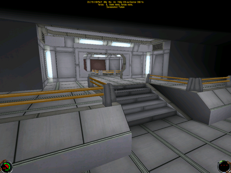
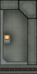
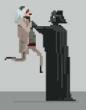
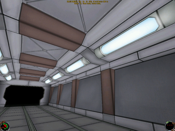
Just started figuring out how to do textures from scratch. nothing too complicated so far, but still spent WAY to long on what i have so far.

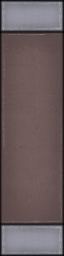
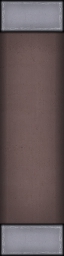
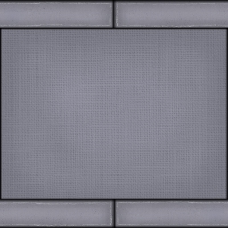
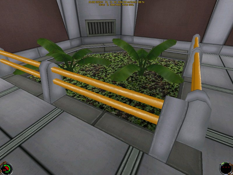
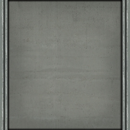
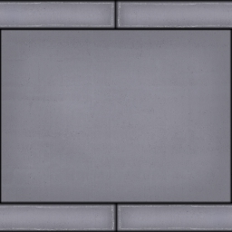
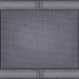
here is a small sample:


any suggestions, advice or tricks/tips on making textures?? :suicide:
Welcome to the douchebag club. We'd give you some cookies, but some douche ate all of them. -Rob
2012-10-03, 6:08 PM #2
Looks great if you are going for a less-than-photorealistic style, otherwise needs more detail.
Bassoon, n. A brazen instrument into which a fool blows out his brains.
2012-10-03, 6:48 PM #3
Cell-shaded JK?
And when the moment is right, I'm gonna fly a kite.
2012-10-03, 7:32 PM #4
lol, it does kind of look like that huh?

Originally posted by Emon:
Looks great if you are going for a less-than-photorealistic style, otherwise needs more detail.

thanks!
yeah, I am not too worried about it being photorealistic, I kind of am looking to make it could fit in with either standard JK player and actor models or with something around the detail level of JKE
Welcome to the douchebag club. We'd give you some cookies, but some douche ate all of them. -Rob
2012-10-04, 12:11 PM #5
You oughtta post the textures themselves
2012-10-04, 6:56 PM #6
Here are what i have so far, added a panel/latch to the door, and made a floor texture.
Welcome to the douchebag club. We'd give you some cookies, but some douche ate all of them. -Rob
2012-10-04, 7:37 PM #7
thumbs up
TAKES HINTS JUST FINE, STILL DOESN'T CARE
2012-10-05, 4:52 AM #8
I think they're rather nice but more detail would make them even nicer. You should do a tutorial for JKHUB on the entire process.
? :)
2012-10-05, 8:02 AM #9
The part that gets me is the scratches? at the edges of every surface. Is that supposed to be from wear and tear? If so, it seems way to consistent and widespread. When I look at the textures in the first screenshot, it's the thing that jumps out and seems more 'drawn on' than natural. In general though they look great!
2012-10-05, 12:19 PM #10
Originally posted by saberopus:
The part that gets me is the scratches? at the edges of every surface. Is that supposed to be from wear and tear? If so, it seems way to consistent and widespread.


Yeah that is probably the part that i am the LEAST happy with.
The scratches were done with "scratch brushes" i found online. I think you might be onto something, i think if i even just make it so its not so much of a "solid line" of scratches it would look better. break it up a little and not look so uniform.
Welcome to the douchebag club. We'd give you some cookies, but some douche ate all of them. -Rob
2012-10-05, 12:21 PM #11
Originally posted by Mentat:
You should do a tutorial for JKHUB on the entire process.


Hmm... that could be kind of neat! I'll have to see if i can do that. :)
Welcome to the douchebag club. We'd give you some cookies, but some douche ate all of them. -Rob
2012-10-05, 2:30 PM #12
Originally posted by Darth_Alran:
Hmm... that could be kind of neat! I'll have to see if i can do that. :)


It's a trap!

Anyway, quite neat stuff. Reminds me a bit of MaDa's work too.
Star Wars: TODOA | DXN - Deus Ex: Nihilum
2012-10-05, 6:19 PM #13
Floor texture and light fixture seem to help a bit.
Welcome to the douchebag club. We'd give you some cookies, but some douche ate all of them. -Rob
2012-10-07, 3:18 PM #14
Thinking about going in a slightly different direction. for the most part doing away with the green tint, it kind of limits us to weird military looking things. Also tried to make the highlights/scratches less pronounced.
Think its looking fairly neat so far :)

Welcome to the douchebag club. We'd give you some cookies, but some douche ate all of them. -Rob
2012-10-07, 4:06 PM #15
Damn! That is some impressive cell-shading for JK (even if it's only mimicry). Would be curious how it feels in-game though. Good luck with cell-shading the character models and every other in-game object. :p
My JK Level Design | 2005 JK Hub Level Pack (Plexus) | Massassi Levels
2012-10-07, 5:22 PM #16
Originally posted by Daft_Vader:
Good luck with cell-shading the character models and every other in-game object. :p

It's doable, it'll just take a lot of work.
And when the moment is right, I'm gonna fly a kite.
2012-10-07, 8:15 PM #17
It depends on what you mean by "cel-shading." If you want a convincing ink outline, you can do it, but it may not look very good. If you want to "make it look like a cartoon" that's more dependable.
Bassoon, n. A brazen instrument into which a fool blows out his brains.
2012-10-07, 8:35 PM #18
I think i may keep tweaking things to make them just a little less "cell-shade"-ish. I am fairly certain i wont be able to redo textures for characters and such, so i want to make it look... not so clashy? when compared with standard JK player models.
Welcome to the douchebag club. We'd give you some cookies, but some douche ate all of them. -Rob
2012-10-07, 9:29 PM #19
You're getting that look because the contrast on the edges is too high (making it look like an ink outline) and because there's not a lot of texture to it. That is, it's hard to tell if it's metal, smooth concrete, etc. I think the textures for Elmo's contest entry are a good example of what you're going for.
Bassoon, n. A brazen instrument into which a fool blows out his brains.
2012-10-08, 12:04 AM #20
Ok here are a couple side by sides of two of the textures im messing with.
on this one i removed the hard edges on the red/brownish part and it looks much better in-game.


Then on this one i used a transparent overlay of grey fabric on the main panel to give it some additional texture, any preference on which looks better?? or can you even tell?
Welcome to the douchebag club. We'd give you some cookies, but some douche ate all of them. -Rob
2012-10-08, 12:06 AM #21
The overlay looks better, though it might need to be darker. You might try doing something similar using the various JK textures as an overlay. Experiment with different blending modes in Photoshop, e.g. 'color'
Bassoon, n. A brazen instrument into which a fool blows out his brains.
2012-10-08, 3:59 PM #22
Is it supposed to be fabric? If not, why use a fabric overlay? I'm still a little confused over what it's supposed to be.
TAKES HINTS JUST FINE, STILL DOESN'T CARE
2012-10-08, 4:06 PM #23
It's just supposed to be some random hard surface (metal/concrete/plastic) paneling. just using different overlay things to get different textured surfaces.
Welcome to the douchebag club. We'd give you some cookies, but some douche ate all of them. -Rob
2012-10-08, 4:09 PM #24
starting to look slightly less like "cell shading"
Welcome to the douchebag club. We'd give you some cookies, but some douche ate all of them. -Rob
2012-10-08, 7:35 PM #25
Ok, im sure you guys are getting tired of me posting over and over again, but the feedback is actually helping a lot. I think, lol.

Here's a side by side of the first version of the texture and the latest one i have.

Is it looking better, or did i go right off the opposing cliff and remove TOO MUCH contrast between panels?
Welcome to the douchebag club. We'd give you some cookies, but some douche ate all of them. -Rob
2012-10-09, 5:56 PM #26
Reducing the contrast was definitely the right idea, but the thickness of the lines matters too. It's a step in the right direction.
TAKES HINTS JUST FINE, STILL DOESN'T CARE
2012-10-10, 1:26 PM #27
Lookin' much better. You could easily get away with using them now, with the proper lighting, but don't stop now--they're gettin' better & better.
? :)
2012-10-10, 2:14 PM #28
Yeah the main source of the cel-shaded appearance is the 'ink outline' effect you get by having each texture be a single metal panel w/ too-dark beveled edges or that black border.

They're looking better with every iteration! Keep em coming.
2012-10-10, 3:43 PM #29
Making metal in newer games is easy because of support for pixel shaders. JK doesn't have that, so you have to give the visual cue some other way. Scratches and paneling are two ways to do that. Scratches with shiny highlights look good on floors, and some amount of paneling on the walls does a good job to suggest that it's metal. Other details like screws and rivets might also help and are pretty common in older textures.
Bassoon, n. A brazen instrument into which a fool blows out his brains.
2012-10-10, 9:41 PM #30
looking quite a bit better I think. I still need to rework the floor and probably the grey/green trim in the recessed spots in the ceiling and the "door frames". but i think things are slowly coming together!
Welcome to the douchebag club. We'd give you some cookies, but some douche ate all of them. -Rob
2012-10-11, 8:21 AM #31
That's a good point, Emon. I do think that there are certain moments where the edge should be removed or brightened, because the overall feel (while still improving with each shot, impressive!) is hanging on to cel-shading a little bit.

The edges of the ceiling beams, and the edges of the posts supporting the rope or whatever shouldn't be dark like that, for example, unless you've got a metal panel on one face of it, and a metal panel on the other, and then a seriously deep groove or indentation along the edge. I do understand that there's only so many custom textures you want to make for various quirks of geometry, but if you are interested in minimizing the cel-shaded appearance, that's one thing I'd try.
2012-10-11, 8:46 AM #32
You mean those X-shaped cross supports? Yeah. I would make the shadow only on one side, to make it look like it was being cast from light, and keep it light. It will give a better depth hint.
Bassoon, n. A brazen instrument into which a fool blows out his brains.
2012-10-11, 10:44 AM #33
I think saberopus was talking about the barrier/railing posts with the orange rails which yeah, that one is all kinds of yick.

But, i think your right Emon. I've been looking at a bunch of other textures and at least with older games it always seems like two sides of a texture will have "highlights" and the other two are shadowed.
Welcome to the douchebag club. We'd give you some cookies, but some douche ate all of them. -Rob
2012-10-12, 6:35 PM #34
took a little bit of a break from actual texture work today and re-did the railing 3do(although i did completely re-do the orange rail texture.) and did a little bit of work fleshing out this... facility, or whatever it is.

Welcome to the douchebag club. We'd give you some cookies, but some douche ate all of them. -Rob
2012-10-13, 3:04 AM #35
I really like that grey texture with yellow lines.
Star Wars: TODOA | DXN - Deus Ex: Nihilum
2012-10-13, 6:14 AM #36
/me cracks his knuckles

>_>
<_<
>_>
<_<


I SEE DFLT.MAT!
And when the moment is right, I'm gonna fly a kite.
2012-10-13, 2:58 PM #37
:argh: Dagnammit!!!

There!
Welcome to the douchebag club. We'd give you some cookies, but some douche ate all of them. -Rob
2012-10-14, 3:38 AM #38
That is some pretty sweet foliage if i do say so myself...

Welcome to the douchebag club. We'd give you some cookies, but some douche ate all of them. -Rob
2012-10-16, 12:14 AM #39
Hmm... kinda feel like i should have started a different thread for the actual level part of this, but oh well.

Welcome to the douchebag club. We'd give you some cookies, but some douche ate all of them. -Rob
2012-10-16, 4:17 AM #40
I see kybodyb.mat
Star Wars: TODOA | DXN - Deus Ex: Nihilum
12

↑ Up to the top!