Results 1 to 4 of 4

Thread: Anything Aesthetics & Design Choices

  1. #1

    Anything Aesthetics & Design Choices

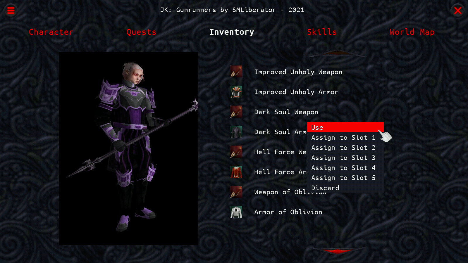
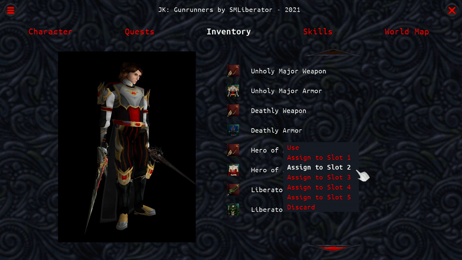
    I'm working on an in-game GUI for JKGR but am unsure about the whole visuals of it. Which of these left-click menus do you think fits better with the overall color scheme? Or should I do something else entirely different? I'm open to suggestions
    Click image for larger version. 

Name:	In-Game UI7 A.jpg 
Views:	74 
Size:	274.3 KB 
ID:	28841Click image for larger version. 

Name:	In-Game UI7 B.jpg 
Views:	68 
Size:	277.8 KB 
ID:	28842

  2. #2

    NIKVMVS-REX-TODOA

    Posts
    17,533
    The one on the left even though I'd try to have a different background for the pop-up box

  3. #3
    I prefer the bottom one where the selected text turns white, which matches the category text color. It's cleaner, easier to read, and it's easily identified as the selection.
    "I would rather claim to be an uneducated man than be mal-educated and claim to be otherwise." - Wookie 03:16


  4. #4
    The second one does match the theming better, but I also think the popup needs a different background color, probably plain black would be fine.
    $do || ! $do ; try
    try: command not found
    Ye Olde Galactic Empire Mission Editor (X-wing, TIE, XvT/BoP, XWA)

Posting Permissions

  • You may not post new threads
  • You may not post replies
  • You may not post attachments
  • You may not edit your posts
  •