Massassi Forums Logo

This is the static archive of the Massassi Forums. The forums are closed indefinitely. Thanks for all the memories!

You can also download Super Old Archived Message Boards from when Massassi first started.

"View" counts are as of the day the forums were archived, and will no longer increase.

ForumsDiscussion Forum → Massassi 2 Shots (warning, 480k of images)
12
Massassi 2 Shots (warning, 480k of images)
2003-12-14, 12:24 AM #1
Been working on the new Massassi back-end (not rewriting everything, simply updating it to be more secure and to use a decent template system in anticipation of the new design). The design shown here was created by Kedri quite a while ago, I merely plugged our database into it. The design is by no means final. The shots show the main page and two admin screens.

http://www.massassi.net/etc/m2_1.jpg
http://www.massassi.net/etc/m2_2.jpg
http://www.massassi.net/etc/m2_3.jpg

[This message has been edited by Brian (edited December 15, 2003).]
2003-12-14, 12:32 AM #2
It's nice, but I somewhat dislike that logo.

------------------
When bread becomes toast, it can never go back to being bread again.
The music industry is a cruel and shallow money trench where thieves and pimps run free, and good men die like dogs. There's also a negative side.
2003-12-14, 12:32 AM #3
*notices Kara screenshot and gets nostalgic*

Anyway, looks good to me. Left hand menu background texture is a bit generic...but otherwise, kedrilicious.

------------------
Cantina Cloud | BCF | The Massassian & A Very Massassian Xmas
Corrupting the kiddies since '97
2003-12-14, 12:42 AM #4
That design has been made for ages (http://www.massassi.net/2/ has been my homepage since... well a good while).

It's good to see that you're actually doing something with it though [http://forums.massassi.net/html/smile.gif]

------------------
WARNING: THIS POST MAY CONTAIN TRACES OF PEANUT!!!
TheJkWhoSaysNiTheJkWhoSaysNiTheJkWhoSaysNiTheJkWho
SaysNiTheJkWhoSaysNiTheJkWhoSaysNiTheJkWhoSaysNiTh
eJkWhoSaysNiTheJkWhoSaysNiTheJkWhoSaysNiTheJkWhoSa
ysNiTheJkWhoSaysNiTheJkWhoSaysNiTheJkWhoSaysNiTheJ
k
WhoSaysNiTheJkWhoSaysNiTheJkWhoSaysNiTheJkWhoSays
N
iTheJkWhoSaysNiTheJkWhoSaysNiTheJkWhoSaysNiTheJkW
2003-12-14, 12:45 AM #5
If you look closely at /2/, there are significant differences (the one in these shots is the original Kedri made, the one in /2/ is missing a lot of the footer stuff [which you can't see in my shots... doh], and a lot of the style sheets are broken [at least in Opera, I haven't checked other browsers]).
2003-12-14, 1:39 AM #6
Great... Now upgrade the forums [http://forums.massassi.net/html/wink.gif]

------------------
The Massassi-Map
There is no spoon.
The Massassi-Map
There is no spoon.
2003-12-14, 1:53 AM #7
I CAN SEE ORBITAL EXTREME!!11

I mean, niiice. I kinda agree with flexor though, but it looks better than what it used to be, so yeah.. [http://forums.massassi.net/html/smile.gif]

Edit: Don't rename the forums to Message Boards, that sounds too weird. [http://forums.massassi.net/html/tongue.gif]

------------------
Map-Review | Digital Core | The Matrix: Unplugged

Farewell, MaDaVentor. In our hearts, you'll always live on.

[This message has been edited by gothicX (edited December 14, 2003).]
2003-12-14, 2:06 AM #8
I personally liked the old sidebar's texture
[edit] i noticed something, Dark Forces is up there, are we doing files for that sometime soon?[/edit]
------------------
" You killed me. That wasn't very nice."
Noble Gases

[This message has been edited by Genki (edited December 14, 2003).]
Holy soap opera Batman. - FGR
DARWIN WILL PREVENT THE DOWNFALL OF OUR RACE. - Rob
Free Jin!
2003-12-14, 2:31 AM #9
hmm looks fine for me. But, i must agree with gothicX. Message Board name sux. Keep old Forum if you can.

------------------
The miners of Kiith Somtaaw sacificed much, and risked all. For their efforts they were brought into the inner most circle of Hiigaren power. Naabal, S'jet, and Sobanii bowed before them. And from that day to this, Somtaaw's children have been known to one and all as Beastslayers..
2003-12-14, 2:37 AM #10
The site and Logo looks great.
2003-12-14, 3:14 AM #11
I perferred the old News script look. The colors are fine, but I liked the script taking up the whole screen, not stuck in a table.

Also, what happened to the 'output News' option? No longer required?

------------------
"The future is not determined by a throw of the dice, but is determined by the conscious decisions of you and me."
I am addicted to ellipses!!! AHHH!!! ...
2003-12-14, 3:22 AM #12
Everything looks awesome, but the original logo (by Ewok someone or other) is just...Massassian, if you get my meaning.

However, just one teeny tiny wittle little complaint. Too much green. It needs to be blue or red. [http://forums.massassi.net/html/biggrin.gif]

------------------
I am a nobody, and nobody is perfect; therefore, I am perfect.

Everyday I beat my own previous record for number of consecutive days I've stayed alive.

[url="mailto:Bruintone@netscape.net"]mailto:Bruintone@netscape.net[/url]Bruintone@netscape.net</A>
Yahoo! Name : jedibruintone77
I am a nobody, and nobody is perfect; therefore, I am perfect.

Everyday I beat my own previous record for number of consecutive days I've stayed alive.

My Canada includes Beavers.
2003-12-14, 3:38 AM #13
Quote:
<font face="Verdana, Arial" size="2">i noticed something, Dark Forces is up there, are we doing files for that sometime soon?</font>


I hope so, that would be really cool.

Everything looks great except the red news headers. I especially like the logo and the menu system.


------------------
http://www.napalmdeathsquad.com
2003-12-14, 3:52 AM #14
I donno, it kindof reminds me of jedinights for some reason :x

------------------
Do you have stairs in your house?
2003-12-14, 3:59 AM #15
I like the look of the new news script. [http://forums.massassi.net/html/biggrin.gif]

------------------
<kyle90> i got my SAT scores back
<kyle90> according to the sheet i got sent in the mail, I did "better than 99% of all college-bound seniors"
<kyle90> of course, thats comparing me to americans
<kyle90> so its not really a fair assessment
That painting was a gift, Todd. I'm taking it with me.
2003-12-14, 4:05 AM #16
I like that design, and the news script looks good, but I have but one suggestion...

I think the advertising banner would look better centered in the middle "news" area, and the "shot of the day" side bar moved up to be at the same height as the other news bar. Just a suggestion...
2003-12-14, 5:56 AM #17
I dont like the top bar thing.. Its alright.. But it just isnt.. massassi

------------------
Happy "Diseased" dud: You said I'd be like this guy. Boycotting everything..
Happy "Diseased" dud: ted kazcnisky. That's who it was.
Happy "Diseased" dud: Wait, That's the unibomer.
Happy "Diseased" dud: Wrong guy.
"If you watch television news, you will know less about the world than if you just drink gin straight out of the bottle."
--Garrison Keillor
2003-12-14, 5:59 AM #18
I prefer today's design [http://forums.massassi.net/html/frown.gif]

Also, people like the word "forum"

BTW, where's the screenshot of the day?
------------------
Snail racing: (500 posts per line)
---@%

[This message has been edited by Echoman (edited December 14, 2003).]
SnailIracing:n(500tpostshpereline)pants
-----------------------------@%
2003-12-14, 6:08 AM #19
"BraticX"

Hee-hee.

------------------
"LC Tusken: the idiot is the person who follows the idiot and your not following me your insulting me your following the path of a idiot so that makes you the idiot"
Jack Chick preaches it
NMGOH
the idiot is the person who follows the idiot and your not following me your insulting me your following the path of a idiot so that makes you the idiot - LC Tusken
2003-12-14, 6:25 AM #20
Change.... is.... not... good.... (look at the star wars movies, for example. The new ones are just...eck)

------------------
"answer to life the universe and everything = 42" - Google calculator
2003-12-14, 7:01 AM #21
...why is everyone commenting on the design?

Quote:
<font face="Verdana, Arial" size="2">
The design is by no means final.
</font>

Quote:
<font face="Verdana, Arial" size="2">
The design is by no means final.
</font>

Quote:
<font face="Verdana, Arial" size="2">
The design is by no means final.
</font>


------------------
Bassoon, n. A brazen instrument into which a fool blows out his brains.
2003-12-14, 7:07 AM #22
it looks good, the title graphic especially.

[This message has been edited by Pagewizard_YKS (edited December 14, 2003).]
2003-12-14, 7:12 AM #23
Quote:
<font face="Verdana, Arial" size="2">Originally posted by Emon:
...why is everyone commenting on the design?

</font>


Since it's not final, it seems logical to tell him what we dislike about it.

------------------
When bread becomes toast, it can never go back to being bread again.
The music industry is a cruel and shallow money trench where thieves and pimps run free, and good men die like dogs. There's also a negative side.
2003-12-14, 7:14 AM #24
I like the new logo with Kyle and the Moldy Crow.
Looks good.

------------------
To artificial life, all reality is virtual.
2003-12-14, 7:17 AM #25
Don't say "check out more" that sounds so unprofessional [http://forums.massassi.net/html/tongue.gif]
Say "view more" or something [http://forums.massassi.net/html/biggrin.gif]

------------------
Do you have stairs in your house?
2003-12-14, 7:42 AM #26
Admin section looks good. [http://forums.massassi.net/html/biggrin.gif] The edit/delete portion is great, but wouldn't it be better to be able to mass delete by clicking check boxes instead of links?

For example instead of a link that says "delete" in the last column, it'd be more convient to have a checkbox there. Then, at the bottom there could be a button that says "Delete". Then again, with a news script you rarely ever need to mass delete, my suggestion makes more since for a forum.
2003-12-14, 7:57 AM #27
I like the new layout, but I agree with some others as to what has been said. Message Boards needs to be changed back to Forums. Also, I don't really like the new logo. It looks like a logo that would appear on someone's personal JK site, not on a professional community site like Massassi. The best logos are mostly original, and don't borrow images from other sources, IMHO.

------------------
"I'm a funny guy, really I am."
Marsz, marsz, Dąbrowski,
Z ziemi włoskiej do Polski,
Za twoim przewodem
Złączym się z narodem.
2003-12-14, 8:22 AM #28
Quote:
<font face="Verdana, Arial" size="2">Originally posted by Snake-Eyes:
Everything looks awesome, but the original logo (by Ewok someone or other) is just...Massassian, if you get my meaning.

However, just one teeny tiny wittle little complaint. Too much green. It needs to be blue or red. [http://forums.massassi.net/html/biggrin.gif]

</font>


I presume you're joking, heathen. [http://forums.massassi.net/html/tongue.gif]

------------------
tristan is the best friend of the jedi

"I am the signature virus! Copy me into your signature so that I can take over the world! Moohahahee!"
tristan is the best friend of the jedi

"I am the signature virus! Copy me into your signature so that I can take over the world! Moohahahee!"
2003-12-14, 8:29 AM #29
Well since this design is nothing like the design Kedri was working on before his untimely vanishing act there's not much point saying it's ugly.

Brian, I know Kedri has his reasons for being unavailable but i'm sure he would forward you a screenshot of what he was working on, it really is a beautiful design.
Detty. Professional Expert.
Flickr Twitter
2003-12-14, 9:11 AM #30
Quote:
<font face="Verdana, Arial" size="2">Originally posted by DeTRiTiC-iQ:
Well since this design is nothing like the design Kedri was working on before his untimely vanishing act there's not much point saying it's ugly.

Brian, I know Kedri has his reasons for being unavailable but i'm sure he would forward you a screenshot of what he was working on, it really is a beautiful design.
</font>


I agree, I saw Kedri's UBERSECRET design, and I must say, it was quite extrordinary.

Hopefully, when/if Kedri returns, you can mix the new backend with his frontend (that sounds so naughty).

------------------
1 of 14 - The Coucil still lives
6-16 Never Forget.
Click.
1 of 14 | 6-16 Never Forget. | Click.
2003-12-14, 9:31 AM #31
I'm liking it, but the leaves are kind of bland. They could work for the menu, but there needs to be some sort of border, and maybe vines and what-have-you blended in as well. Also, those bars seperating the news posts should be larger or they should be a background for the date. Also maybe a border for the right menu instead of a bar (something that would blend in with the graphics for the EC and SotD tabs).

Just my suggestions... if these things were brought up by someone else, shoot me.

[Edit: I just saw massassi.net/2 - that's exactly what I was talking about for the news dividers, so keep it!]

------------------
"And I listen for the whisper of your sweet insanity, while I formulate denials of your affect on me. You're a stranger, so what do I care. Vanish today, not the first time I hear, all the lies..."

[This message has been edited by Mr. Alias (edited December 14, 2003).]
"I'm praying for mayhem, I'm praying for tidal waves, I wanna see the ground give way, I wanna watch it all go down..."
2003-12-14, 9:43 AM #32
Jedi_Legend, good point on the mass delete. I'll consider it.

It would be easy to plug any design into this. I don't think this design is ugly, in fact, I really like it. But if Kedri has something more modern and more eye catching, that's just great for me [http://forums.massassi.net/html/smile.gif]

Unfortunately, nobody has heard from Kedri in a long time, so I'm not keeping my hopes up.
2003-12-14, 11:02 AM #33
Did you dump your really really old version of M2, or is it implemented into this version?

I liked it [http://forums.massassi.net/html/tongue.gif]

Good work.

------------------
Sigs are for n00bs.

[1337 FRNDS_Pommy | 3.14 of 14 | ยป And-GTx2]
Half-Life 2 Central - your definitive source for everything HL2!
一个大西瓜
2003-12-14, 4:37 PM #34
I dunno, something about it doesn't seem... sturdy enough. The layout doesn't seem to have that strong foundational structure appeal that the old/current design. Sorry for the vague response, but hopefully you'll understand what I mean.

On another note, I had another request if/when we upgrade our forums. I don't know if this is standard now in most forum systems, but if an easy code for anchoring could be included (that is, have a clickie that not just takes you to a page, but automatically scrolls it down to a specific point), I'd much appreciate it [http://forums.massassi.net/html/smile.gif]

------------------
Check out the following stories over at the Interactive Story Board:
The Never-ending Story Thread or visit the new webcomic version!
The Vision Cycle series
Featured Story: Dead
The Plothole: a home for amateur, inclusive, collaborative stories
http://forums.theplothole.net
2003-12-14, 5:26 PM #35
Email Brian.

------------------
-=I'm the wang of this here site, and it's HUGE! So just imagine how big I am.=-
1337Yectiwan
OSC Returns!!
10 of 14 -- 27 Lives On
-=I'm the wang of this here site, and it's HUGE! So just imagine how big I am.=-
1337Yectiwan
The OSC Empire
10 of 14 -- 27 Lives On
2003-12-14, 5:28 PM #36
Eh?
The Plothole: a home for amateur, inclusive, collaborative stories
http://forums.theplothole.net
2003-12-14, 5:39 PM #37
there should've been a comma in there

email, brian.

------------------
-=I'm the wang of this here site, and it's HUGE! So just imagine how big I am.=-
1337Yectiwan
OSC Returns!!
10 of 14 -- 27 Lives On
-=I'm the wang of this here site, and it's HUGE! So just imagine how big I am.=-
1337Yectiwan
The OSC Empire
10 of 14 -- 27 Lives On
2003-12-14, 6:21 PM #38
Brian, you are easily the only person who I would support in the making of Massassi II.

------------------
Duel Zero key count: Zero! Down to guns and forces. Expect a release soon.
2003-12-14, 11:28 PM #39
Okay, maybe I should clarify what I am doing and why I am doing it.

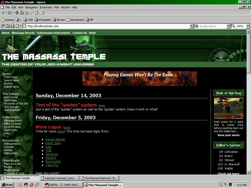
First of all, one of the major reasons Massassi isn't featured in the top of major search engine results is our use of FRAMES. Frames are what allows the right side of the massassi main page to scroll independently from the menu. When search engines crawl our pages, they don't get any navigation elements (because they don't see the menu).

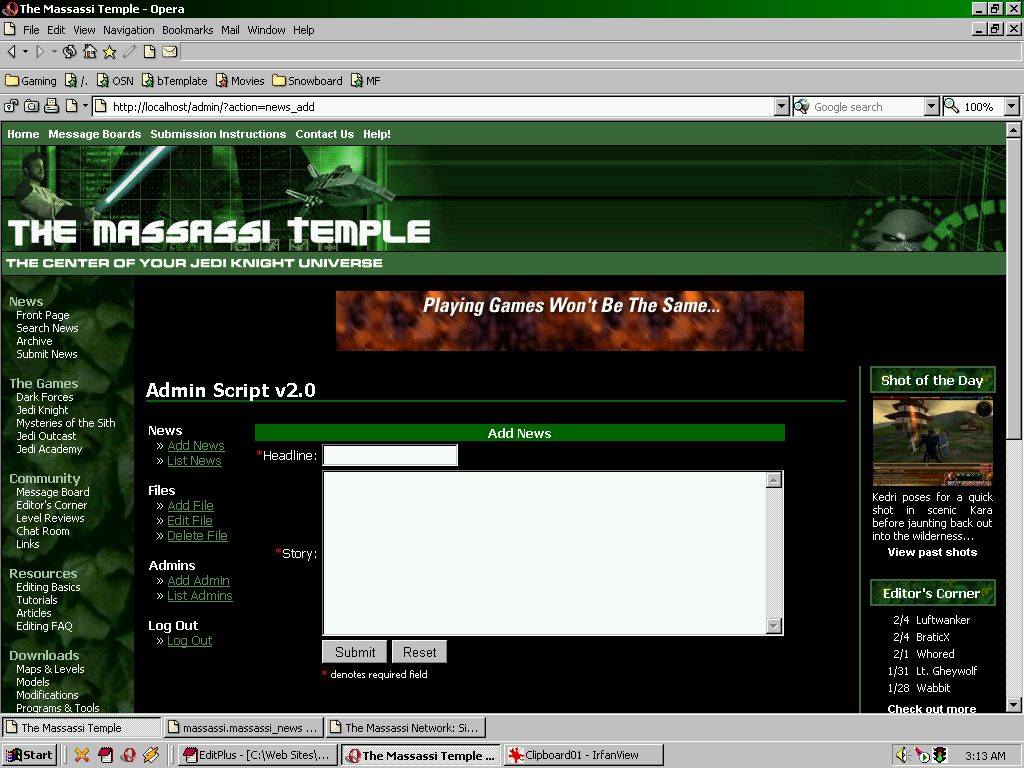
Second, the Massassi admin script is insecure. Enough said.

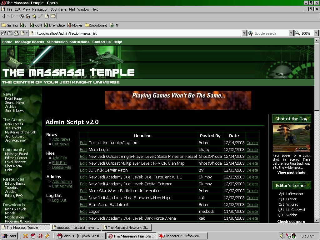
Third, the Massassi admin script is not centralized. Things like the admin for sotd and mats are not in the same place as news and levels. This needs to be fixed.

Fourth, the Massassi admin scripts are all in various states of disrepair. They were all written when I was a lot younger and a lot less experienced. I'm not rewriting everything, more like refactoring.

Fifth, a lot of them can be grouped together. For instance, I'm going to make a generic "files" admin script. It can be used for all the stuff in our programs, levels, mats, 3dos, etc. You can add any categories and add any file type under them. Comments will then be available for every file type.

Sixth, I want to implement a lot of the suggestions people have made. In order to do this, I need a solid foundation for the site. This foundation needs to be on a set of secure, quick, and easily expandable scripts. I have accomplished that. I have implemented a new news script in about 2 hours. That shows how easy it is for programmers to work in the new foundation (as long as their familiar with templating, OOP, and some of the freely available PEAR classes).

Seventh, I'm making a "page" administration script. All pages will be thus saved in the database and outputted based on current templates. This means all "static" pages (tutorials, info pages, submission instructions, etc.) will all be stored in the database and outputted as files whenever the templates change. We will get the benefits of a dynamic solution without the overhead. And it's *easy* to program (really, I'm about halfway done already and I've only worked on it for about an hour or two).

Eighth - and this is probably most apparent to end-users. We will have the ability to completely change the site design simply by swapping out templates. We can then output all the files we need to and the entire site is updated. So even if you don't like the design shown above, at least THIS time, it won't be a major undertaking to change it. To do the conversion right now, we're basically converting thousands of pages programmatically, and at least hundreds manually. In the future, once *all* content is in a database, we will easily be able to make sweeping design changes with a few clicks.

Hope this clears up some confusion.
2003-12-14, 11:30 PM #40
Yecti, I don't think I have anything from you at all... maybe you should resend it?
12

↑ Up to the top!