Originally posted by Vin:
It's not just the menus, either. Nearly every single icon in that program has been grayscaled and "simplified." Seeing them side by side now for the first time, I realize a lot of the new icons make sense. Maybe I just hate change. 

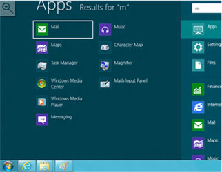
It's not just the icons. The entire UI has been grayscaled and "simplified." Simplified meaning they have removed anything that would demarcate the background from something you can interact with.


